Visual Fail States: Using AI Imagery to Signal Risk, Reward, and Consequences in Questas


Interactive stories live and die on one core feeling: my choices matter.
If players can’t feel the stakes of a decision—if every path looks the same, or consequences are buried in text—they’ll default to skimming and clicking whatever’s closest.
That’s where visual fail states come in.
On Questas, you’re already working in a visual, no‑code editor. You’re stitching together branching scenes, decisions, and AI‑generated media. Visual fail states are a way to use those images and videos as feedback systems:
- To warn players when they’re flirting with danger
- To celebrate when they’ve earned something rare or meaningful
- To make consequences feel seen, not just described
Done well, visual fail states don’t just decorate your story—they teach your players how your world works.
What Is a “Visual Fail State,” Really?
In classic games, a fail state is obvious: your character dies, the screen fades to black, a big “Game Over” appears.
In interactive stories on Questas, fail states can be subtler and more interesting:
- A negotiation goes sideways and the next scene shows a tense, dimly lit boardroom instead of a bright, collaborative one.
- A player ignores safety training and the following image shows a near‑miss accident instead of a smooth operation.
- A character’s trust drops, and the visuals shift from warm, close framing to distant silhouettes.
A visual fail state is any distinctive visual outcome that communicates:
- Risk – “You’re close to something bad happening.”
- Loss – “You missed an opportunity or damaged a relationship.”
- Consequence – “Because you chose X, the world now looks like this.”
Crucially, it doesn’t have to be a dead end. If you’re interested in recoverable mistakes and second chances, pair this article with your design approach from Designing ‘Soft Fails’: How to Let Players Backtrack, Reroute, and Recover Inside Questas Adventures.
Why Visual Fail States Matter for Questas Creators
Whether you’re building a fantasy adventure, a leadership simulation, or a marketing funnel, visual fail states help you:
1. Make stakes instantly legible
Players process images much faster than text. A single AI‑generated frame of a flooded hallway, a broken prototype, or an empty classroom can communicate “something went wrong” before the player reads a word.
2. Turn abstract concepts into felt experiences
For training, policy, or social‑impact scenarios, consequences are often abstract—compliance risk, user churn, reputational damage. Visualizing these as story events (angry customers, news headlines, burned‑out staff) makes them emotionally real. This is exactly the kind of consequence‑driven storytelling explored in Branching Narratives for Change-Making: Using Questas to Prototype Policies, Futures, and Social Impact Campaigns.
3. Encourage experimentation instead of fear
When players can see what went wrong and still continue, they understand that “failure” is part of the experience, not a punishment. That builds trust and invites replays.
4. Reduce text overload
Instead of writing three paragraphs explaining why a choice was risky, you can:
- Show the same room, now cluttered, darker, and more chaotic
- Cut to a visual metaphor (a cracking bridge, a frayed rope)
- Use character expressions to tell the story
5. Improve memory and learning
Research on multimedia learning consistently shows that people remember information better when it’s paired with relevant visuals, especially when those visuals depict cause and effect. Visual fail states give your players concrete mental snapshots tied to specific decisions.
The Three Visual Languages of Consequence: Risk, Reward, and Fallout
Before you start generating images, define your visual language for three categories:
- Risk Signals – cues that danger or loss is possible soon
- Reward Signals – cues that something rare, safe, or beneficial is near
- Fallout States – clear depictions of what happens when things go wrong (or wonderfully right)
1. Risk Signals
Risk visuals should whisper (or shout), “Are you sure?” without you needing to spell it out.
Common visual levers:
- Lighting: shift from neutral to dim, high‑contrast, or harsh backlighting.
- Color palette: introduce desaturated tones, sickly greens, warning reds, or cold blues.
- Composition: tilt the camera, crowd the frame, or obscure important elements.
- Environmental detail: cracks in walls, warning signs, storm clouds, cluttered desks, unread notifications.
- Body language: characters leaning back, folded arms, averted gazes, subtle frowns.
In Questas, risk signals work well:
- In choice setup scenes – images that precede a critical decision.
- As micro‑feedback – quick cutaways after a choice to show subtle shifts.
2. Reward Signals
Reward isn’t just treasure. It’s clarity, safety, progress, or emotional connection.
Visual cues for reward:
- Lighting: soft, warm, or rising light; visible sunbeams; clear visibility.
- Color palette: richer saturation, harmonious colors, golds and greens for growth.
- Composition: balanced framing, open horizons, clear paths.
- Environmental detail: tidy workspaces, thriving plants, upgraded equipment, celebratory confetti.
- Body language: characters leaning in, smiling, making eye contact, open gestures.
Use reward visuals to mark:
- Milestones (promotion, breakthrough, safe arrival)
- Secret paths (hidden rooms, bonus lore, rare endings)
- Corrective choices (recovering from a soft fail)
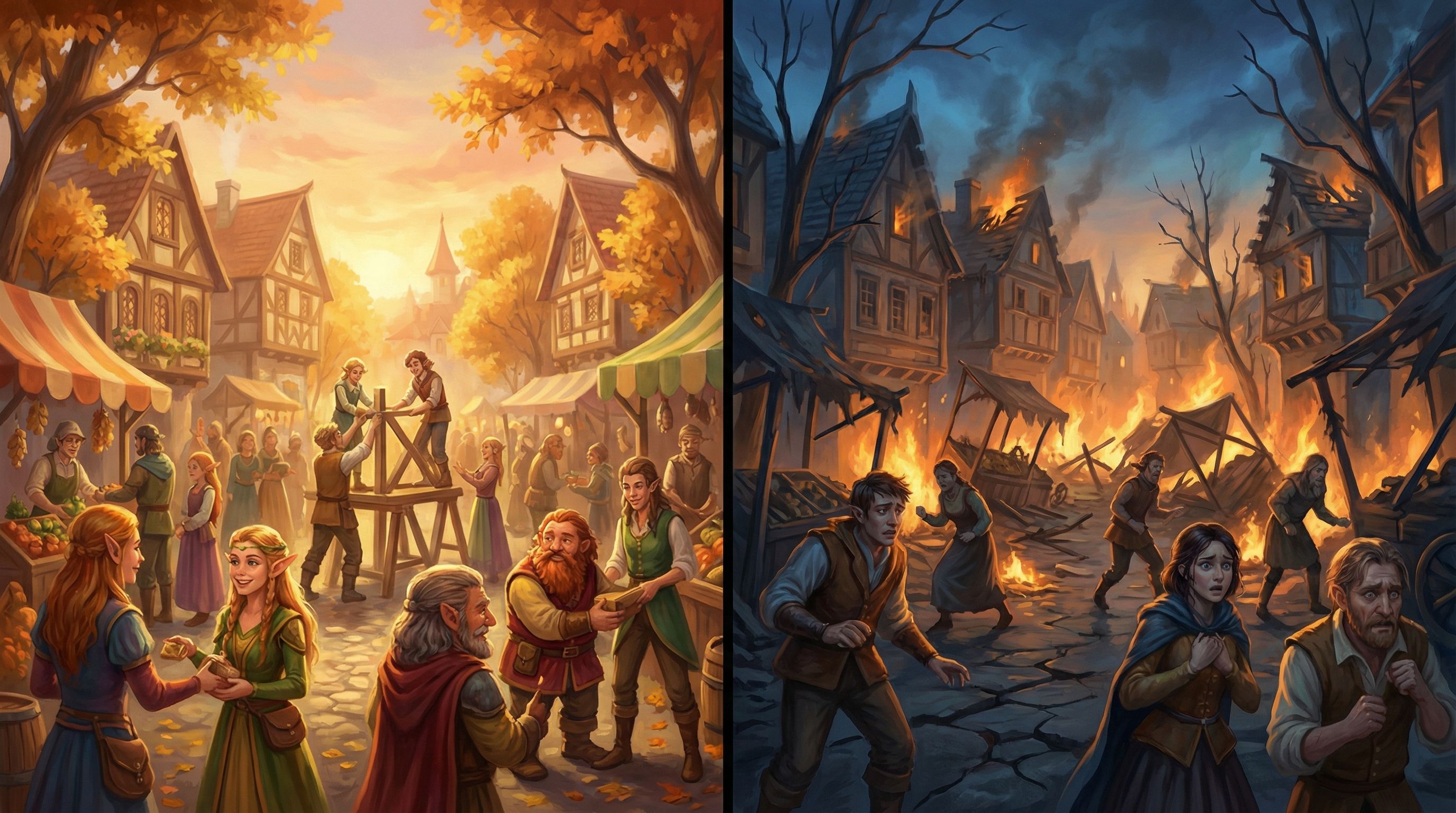
3. Fallout States
Fallout visuals show the result of a risky or poor choice:
- A server room in chaos after ignoring a warning alert
- A protest outside HQ after a questionable policy decision
- A character sitting alone after multiple trust‑breaking choices
These scenes should feel distinct from neutral states. Players should immediately recognize: “This is different because of what I did.”
Designing Visual Fail States in Questas: A Practical Workflow
Let’s walk through a concrete workflow you can use inside Questas for any project.
Step 1: Map Your High-Stakes Moments
Open your story graph and identify:
- Branches where safety, success, or trust can significantly change
- Decisions that teach a core lesson (for training, onboarding, or policy scenarios)
- Moments you want players to talk about later (twists, betrayals, moral dilemmas)
Mark 3–7 of these as “visual consequence anchors.” These are the scenes where you’ll invest in distinctive imagery.
If you’re using Questas for product or UX flows, this might overlap with the moments you’d highlight visually when prototyping journeys, as explored in Beyond Story Mode: Using Questas to Prototype Product UX, Onboarding Flows, and Interfaces.
Step 2: Define Before / After States for Each Anchor
For each anchor, create a simple table (in a doc, spreadsheet, or directly in your scene notes):
- Neutral / Setup state – how the world looks before the decision
- Positive outcome visual – what “success” looks like
- Negative outcome visual – what “failure” or fallout looks like
Example for a leadership training quest:
- Neutral: team meeting room, neutral lighting, mixed expressions, whiteboard with open questions.
- Positive: same room, brighter lighting, team leaning in, whiteboard filled with clear plan.
- Negative: same room, dimmer lighting, some empty chairs, scattered sticky notes, tense faces.
The key is consistency of location and framing so players can easily compare.
Step 3: Write Visual Prompts as Systems, Not One-Offs
To keep your story visually coherent, think in prompt systems, not individual images. The techniques in From Style Transfer to Story Consistency: Advanced AI Visual Workflows for Questas Creators apply perfectly here.
For each anchor, define a base prompt that you’ll tweak for risk, reward, and fallout.
Example base prompt:
“Cinematic, mid‑shot of a modern meeting room with a diverse product team around a table, neutral lighting, semi‑realistic style, soft depth of field, 16:9 ratio”
Then derive variants:
- Risk version:
- “…lighting slightly dim, subtle shadows under eyes, cluttered table with scattered documents, a stormy skyline visible through the window.”
- Reward version:
- “…warm morning light streaming in, organized table with color‑coded notes, whiteboard filled with clear diagrams, relaxed and smiling faces.”
- Fallout version:
- “…harsh overhead lighting, some empty chairs, crumpled papers, tense expressions, a looming deadline timer projected on the wall.”
Store these prompts in your project notes so you can reuse and iterate.
Step 4: Align Visual States With Choice Copy
Visual fail states are powerful, but they shouldn’t feel random. Make sure your choice text and visuals are in sync:
- If the choice is clearly risky, seed risk cues beforehand.
- If the outcome is surprising, the visual should still feel plausible in hindsight.
Example:
- Choice: “Ignore the QA team’s warning and ship the feature anyway.”
- Follow‑up image: a dashboard with red error bars, support tickets piling up, a stressed manager.
Players should be able to think, “Yeah, I kind of saw that coming.” That sense of fairness is what keeps them engaged.
Step 5: Use Soft Fails and Recovery Visuals
Not every fail state should be a dead end. Build recovery branches where players can repair the damage—and reflect that visually.
Visual progression example:
- Fail: chaotic server room, alarms flashing red.
- Recovery choice: “Roll back the deployment and communicate transparently with users.”
- Recovery visual: same server room, alarms off, a small team calmly monitoring dashboards, a notification on screen: “Issue resolved – thank you for your patience.”
The contrast between these images helps players feel the impact of corrective action.
Visual Fail States Across Different Use Cases
Visual consequence design isn’t just for fantasy deaths or sci‑fi disasters. Here’s how it can play out across common Questas projects.
1. Training and Enablement
Use visual fail states to show:
- The result of mishandling a customer escalation (angry reviews, churn graphs)
- The impact of ignoring safety protocols (near‑miss incidents, damaged equipment)
- The consequences of poor communication (confused teams, misaligned documents)
Pair these with branching choices that let learners try again with better decisions.
2. Product and UX Prototyping
When you’re story‑prototyping a product flow, fail states might be:
- A confused user abandoning a signup flow
- A dashboard cluttered with irrelevant data
- A support inbox overflowing after a confusing update
Use imagery to make these outcomes visceral for stakeholders, not just theoretical. This turns your prototype from a diagram into a felt experience.
3. Marketing and Narrative Funnels
In narrative marketing campaigns, visual fail states can:
- Show what prospects miss out on if they delay (empty event seats, missed opportunities)
- Depict humorous “wrong paths” that entertain rather than punish
- Create alternate endings that feel meme‑worthy and shareable
These are the kinds of twists that fuel fan theories and community chatter, especially when combined with strategies from From Clicks to Conversations: Designing Questas Stories That Spark Community and Fan Theories.
4. Fiction and Worldbuilding
For pure storytelling:
- Use environmental degradation (overgrown cities, broken tech) to show the cost of choices.
- Depict alternate timelines visually—two versions of the same city, one thriving, one in ruins.
- Make character arcs visible through their posture, clothing, and surroundings.
Here, visual fail states become a form of visual foreshadowing and payoff.

Common Pitfalls (and How to Avoid Them)
Even experienced creators can stumble when first designing visual fail states. Watch out for these patterns:
1. Overusing “Game Over” Imagery
If every bad choice leads to total catastrophe, players will either play ultra‑cautiously or disengage. Mix in partial failures and soft consequences that complicate the story instead of ending it.
2. Inconsistent Visual Style
If your fail states look like they belong to a different story (wildly different art styles, aspect ratios, or character designs), they’ll distract more than they teach. Rely on a consistent base prompt and tweak mood, not core style.
3. Ambiguous Signals
If players can’t tell whether an image is good, bad, or neutral, the feedback loop breaks. Make sure your lighting, color, and composition clearly lean one way.
4. Moralizing Too Hard
If every “wrong” choice is visually ugly and every “right” choice is glowing and perfect, your story may feel preachy. It’s often more interesting to show trade‑offs—a choice that looks good in one image but reveals costs in another.
5. Ignoring Accessibility
High‑contrast red/green cues might not be legible to all players, and overly busy scenes can overwhelm some neurodivergent audiences. Use multiple channels of feedback—text, icons, and layout—alongside visuals, and keep sensory load in mind.
Quick Patterns You Can Steal
If you want to start using visual fail states this week, here are some ready‑made patterns:
1. The Mirror Room
Show the same location three times:
- Neutral setup
- Slightly degraded (risk)
- Clearly damaged or changed (fallout)
Players instantly see the progression.
2. The Relationship Meter in Disguise
Instead of a UI bar, show a recurring character:
- In warm, close‑up shots when trust is high
- In mid‑shots with neutral expressions at baseline
- In distant, back‑turned, or shadowed shots when trust is low
3. The Dashboard of Doom (or Delight)
For business, training, or SaaS stories, use a recurring “dashboard” image:
- Green, organized, and calm for good outcomes
- Yellow and cluttered for risk states
- Red, noisy, and chaotic for fail states
4. The Time-Lapse City
For social impact or policy narratives:
- Show the same cityscape at different times: thriving, strained, and collapsing.
- Tie each state to specific policy choices.
Bringing It All Together
Visual fail states are less about punishing players and more about teaching through imagery. When you:
- Identify key decision anchors
- Design clear before/after visual states
- Use consistent prompts and styles
- Align images with choice copy and narrative stakes
- Mix failure, recovery, and reward
…you transform your Questas projects from “click‑through stories” into living systems where every choice is visible.
Summary
- Visual fail states are distinctive images or videos that show risk, loss, or consequences of player choices.
- They help players instantly grasp stakes, remember key moments, and feel that their actions matter.
- Design them by:
- Mapping high‑stakes decision points
- Defining neutral, positive, and negative visual states
- Using consistent AI prompt systems for style cohesion
- Aligning visuals tightly with your narrative and choices
- Incorporating soft fails and recovery paths
- Apply this approach across training, product prototyping, marketing, and fiction to make outcomes more vivid and persuasive.
- Avoid common pitfalls like over‑catastrophizing, inconsistent art, ambiguous signals, and accessibility blind spots.
Your Next Move
Open your latest or favorite project in Questas and:
- Pick just three scenes where consequences really matter.
- For each, sketch a neutral, positive, and negative visual state.
- Draft one base AI prompt and two variants (risk and fallout) for each scene.
- Drop those images into your story and play through it once as a new player.
Notice how different the experience feels when the story shows you what went wrong—or right.
If you’d like to go deeper on building reusable structures around these ideas, pair this approach with system‑thinking from No-Code Narrative Systems: Designing Reusable Templates and Story Blueprints in Questas, then start experimenting. Your players are ready to see what their choices really do.