Accessibility by Design: Building Inclusive, Player-Friendly Questas Stories Everyone Can Enjoy

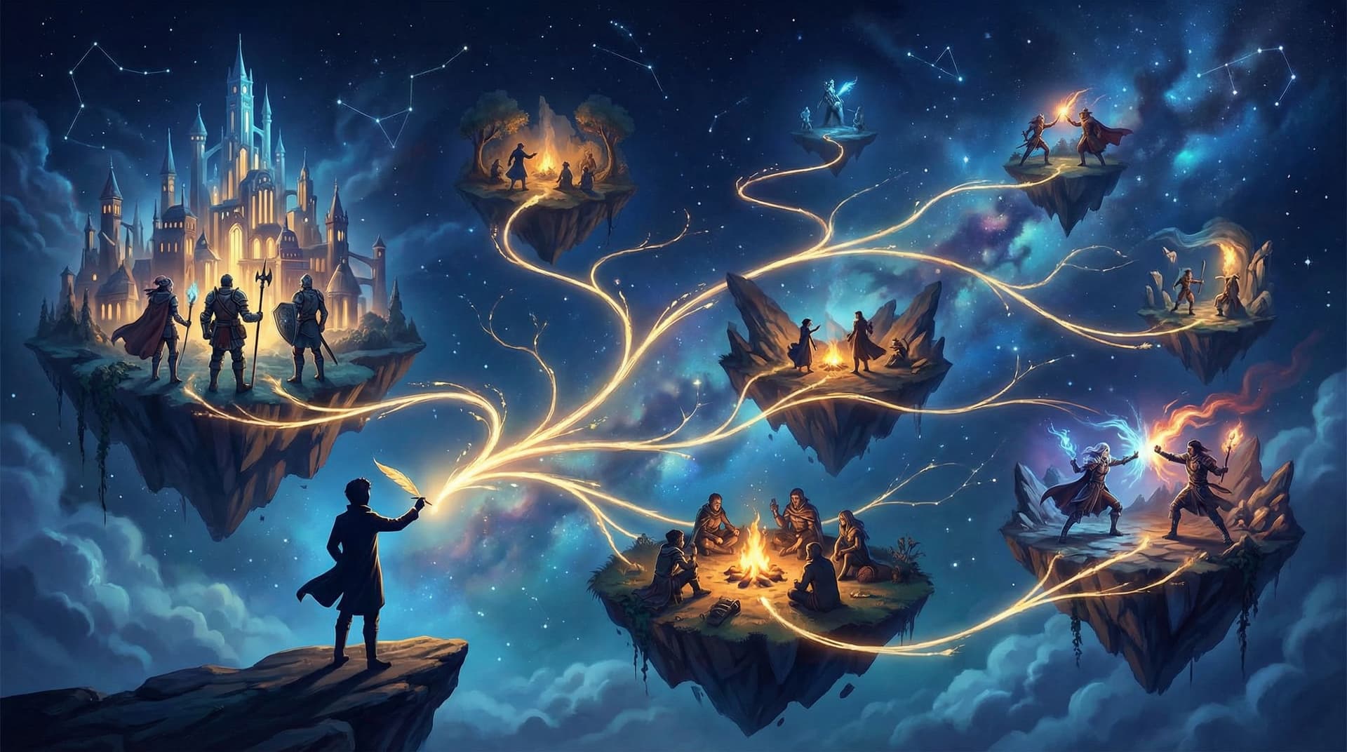
Interactive stories are at their best when everyone can step into the adventure.
If someone can’t comfortably read your text, navigate your choices, understand your visuals, or use your interface, they’re not just having a slightly worse time—they’re effectively locked out of the story you worked so hard to build.
Designing for accessibility isn’t just a nice-to-have. It:
- Expands your audience (including disabled players, older players, and folks on low-end devices)
- Makes your stories easier and more enjoyable for all players
- Future‑proofs your work as accessibility expectations and regulations grow
- Reflects the core spirit of interactive storytelling: participation and agency
With Questas, you already have a visual, no‑code canvas for building branching stories with AI‑generated images and video. Layering accessibility into your process turns that canvas into a space where more people can safely and comfortably play.
This guide walks through practical ways to design inclusive, player‑friendly stories from the very first scene.
What Accessibility Means for Interactive Stories
“Accessibility” can sound abstract, so let’s ground it in what it looks like for a playable story built on Questas.
An accessible story considers players who may:
- Use screen readers or keyboard‑only navigation
- Have low vision, color blindness, or photosensitivity
- Be neurodivergent (ADHD, autism, dyslexia, etc.)
- Have mobility or motor challenges
- Play in noisy environments or without sound
- Struggle with dense text, complex UI, or time pressure
For them, small design decisions make a huge difference:
- Is text large enough and high‑contrast?
- Are choices clear, descriptive, and easy to select?
- Do images and videos have meaningful descriptions or alternatives?
- Can players take their time, or are they racing against hidden timers?
The good news: most accessibility improvements are simple, repeatable habits you can bake into your story‑building workflow.
Start With Player Needs, Not Just Plot
Before you map your branches, take a moment to decide who you’re designing for and what they might need.
Ask yourself:
- Where will people play? On phones during a commute? In a classroom? On a laptop at home?
- What’s their familiarity level? Are they gamers used to complex UI, or readers trying interactive fiction for the first time?
- What abilities are you assuming? Reading speed, color perception, fine motor control, hearing, attention span.
A simple habit: write a short “player profile” in your planning notes:
“This story should be playable on a phone, readable by someone with mild visual impairment, understandable with or without sound, and navigable via keyboard.”
If you’re building a long‑running series, this kind of clarity becomes even more important. For ideas on designing accessible adventures that unfold over multiple episodes, you might also enjoy our post on planning episodic Questas stories.
Make Text Comfortable to Read
Most of your story experience is text: narration, dialogue, and choices. That’s where accessibility wins (or fails) first.
1. Choose readable fonts and sizes
Within Questas, aim for:
- Body text that’s comfortably readable on a small phone screen
- Headings that are clearly larger than body text
- Line spacing with some breathing room (not cramped)
Good rules of thumb:
- Avoid very thin, ornate, or script fonts for main text
- Use consistent sizes across scenes so players don’t have to re‑adjust each time
2. Use high contrast—without relying only on color
Low contrast is one of the most common barriers for players with low vision or color blindness.
Aim for:
- Dark text on a light background, or light on dark—no mid‑tone gray on slightly darker gray
- Clear contrast between interactive elements (buttons, links) and surrounding text
When you color‑code choices (e.g., green for “good,” red for “bad”), always pair color with text:
- Instead of: “Choose the green option to help the villager”
- Use: “Choose ‘Help the villager’ to support them”
3. Write with clarity and structure
Accessible text is:
- Chunked into short paragraphs
- Broken up with subheadings, bullet points, and whitespace
- Written in plain language where possible
Try to:
- Limit very long sentences
- Avoid unexplained jargon
- Use descriptive labels for choices (e.g., “Ask the captain about the map,” not just “Ask more questions”)
This isn’t just good for accessibility—it’s also better storytelling.

Design Choices That Reduce Cognitive Load
Interactive stories ask players to process information and make decisions. For many people—especially those with ADHD, autism, brain fog, or anxiety—too much complexity at once can be overwhelming.
4. Limit choices per scene
More options aren’t always better. Consider:
- 2–4 choices per decision point is usually enough
- If you need more, group related options or spread them across multiple scenes
When every node in your story map explodes into 8+ branches, you’re not just overloading yourself—you’re overloading players.
For help structuring your branches in a way that feels rich but manageable, check out our guide to branching narrative patterns.
5. Make choices predictable and descriptive
Players should understand, at a glance, what each choice roughly means.
Instead of:
- “Yes?” / “No?”
- “…” / “!”
Use:
- “Agree to join the heist”
- “Refuse and walk away”
This helps:
- Screen reader users
- Neurodivergent players who struggle with ambiguity
- Anyone who wants to feel their decisions are informed, not random
6. Avoid unnecessary timers and time pressure
Timed choices can be exciting, but they also:
- Exclude players with motor challenges
- Punish slower readers and non‑native speakers
- Increase anxiety
If you do use time pressure, make it optional or clearly signposted:
- Offer a “relaxed mode” with no timers
- Use timers only for bonus paths, not critical progression
7. Provide gentle guidance, not hidden traps
Accessibility also means respecting players’ mental energy.
Try to avoid:
- “Gotcha” choices that look safe but lead to instant failure
- Long stretches with no chance to save or checkpoint
Instead, consider:
- Periodic summary scenes that recap what’s happened so far
- Clear signals when a choice is high‑stakes (e.g., “This decision will change your relationship with the Guild.”)
Make Visuals and Media Work for Everyone
Questas shines when you lean into AI‑generated images and video. But visuals can quickly become a barrier if they’re not designed thoughtfully.
8. Use images to support, not replace, information
If crucial story details only appear in an image—like a code on a door, or a map route—some players will miss them.
Always:
- Repeat key info in text (e.g., “The code ‘4729’ is scrawled beneath the keypad.”)
- Treat visuals as enhancement, not a sole source of meaning
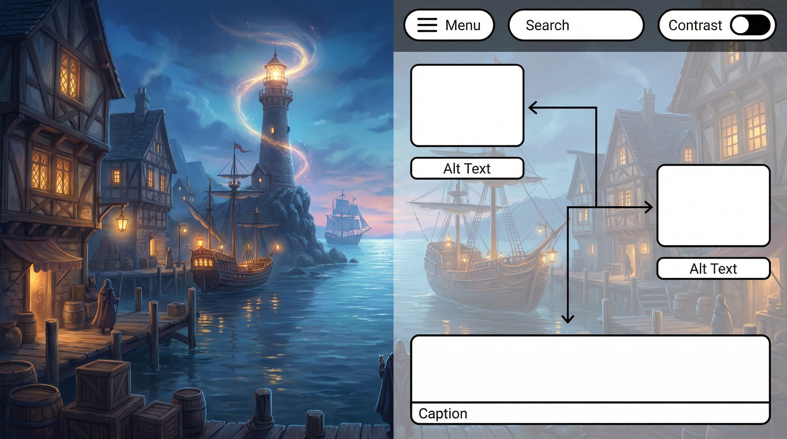
9. Write meaningful alt text and descriptions
When you add an image, imagine how you’d describe it to someone who can’t see it.
Good descriptions:
- Convey the story‑relevant details (who is here, what’s happening, what’s important)
- Skip purely decorative flourishes unless they set tone
For example, instead of:
“A fantasy city”
Use:
“A bustling fantasy harbor city at sunset, with airships docked above stone piers and a lone cloaked figure watching from a balcony.”
If you’re working on consistent characters and worlds, our post on prompting AI for visual consistency can help you keep those descriptions coherent across branches.
10. Be mindful of color, flashing, and motion
Some visuals can trigger migraines, eyestrain, or photosensitive seizures.
Try to:
- Avoid rapid flashing or strobing effects
- Limit intense high‑saturation contrasts that clash
- Offer a “reduced motion” or “low‑stim” variant of key scenes when possible (e.g., fewer animated elements, more static imagery)
If you use video:
- Keep important dialogue and exposition available as text
- Consider adding captions or on‑screen text for key lines
Build Navigation That Welcomes All Players
The structure around your story—menus, buttons, progress indicators—matters just as much as the scenes themselves.
11. Keep controls consistent
Across your Questas story:
- Place Next, Back, and Choice buttons in consistent locations
- Use consistent labels (don’t alternate between “Continue,” “Next,” and “Go” randomly)
- Avoid hiding key actions behind unfamiliar icons with no labels
Consistency helps:
- Keyboard‑only users
- Screen reader users
- Anyone with memory or attention challenges
12. Support keyboard and assistive tech navigation
Even if you’re not coding, you can design with keyboard users in mind:
- Ensure that important interactive elements are clearly visible and not tiny tap targets
- Avoid requiring precise drag‑and‑drop or fast repeated taps to progress
- Keep the number of interactive elements per screen reasonable, so tabbing through isn’t exhausting
13. Provide clear progress and orientation
Getting lost in an interactive story is frustrating—especially if backtracking is hard.
Help players orient themselves by:
- Showing where they are in the experience (chapters, acts, or major locations)
- Offering a simple recap when they return after a break
- Letting them restart from key checkpoints instead of only from the very beginning
If you’re building a long adventure (or series), this kind of scaffolding is critical for both accessibility and retention.
Communicate Options Up Front
One of the most respectful things you can do is tell players what to expect before they dive in.
Consider adding a short “Before You Begin” screen that covers:
- Estimated playtime (e.g., “20–30 minutes for a single run”)
- Content notes (violence, intense themes, etc.)
- Accessibility notes, such as:
- “No timed choices”
- “Playable with keyboard only”
- “High‑contrast text and captions included”
This helps players decide if and how to engage—and builds trust.
If you’re using your story as a portfolio piece or client demo, these notes also signal professionalism. For more ideas on making interactive work shine in a professional context, see our guide to building an interactive portfolio with Questas.
Iterate With Real Players—Especially Those With Access Needs
Accessibility isn’t a one‑time checklist; it’s an ongoing conversation.
14. Invite feedback from diverse players
When you share your Questas story:
- Ask specifically: “Was anything hard to read, see, or navigate?”
- Offer an easy way to respond (short form, email, or comment thread)
- Thank players who share access needs and take them seriously
If you have friends, students, or community members who use assistive tech, invite them to try a draft and share what works or doesn’t.
15. Use analytics to spot friction points
Analytics can’t tell you why something is inaccessible, but it can show you where players are dropping off or getting stuck.
Look for:
- Scenes with unusually high exit rates
- Choices almost no one selects
- Branches that players rarely reach
Then ask: Is this a design problem? A clarity issue? An access barrier?
Our post on using player data to improve your Questas stories walks through how to interpret this kind of data and turn it into better experiences.
16. Treat accessibility as a creative constraint, not a burden
When you design with constraints—limited choices, clear language, thoughtful pacing—you often:
- Sharpen your story
- Make emotional beats land harder
- Create experiences that feel more intentional and polished
Accessibility isn’t about watering down your vision. It’s about crafting it carefully enough that more people can feel it.
A Simple Accessibility Checklist for Your Next Questas Story
As you build or revise your next project on Questas, run through this quick checklist:
Text & Layout
- [ ] Body text is large and readable on mobile
- [ ] High contrast between text and background
- [ ] Paragraphs are short and well‑spaced
- [ ] Choices use clear, descriptive labels
Choices & Structure
- [ ] Most scenes offer 2–4 choices, not 8+
- [ ] No essential choices are hidden behind vague icons
- [ ] No surprise timers or time pressure without warning
- [ ] Major decisions are clearly signposted
Visuals & Media
- [ ] Key information in images/videos is also described in text
- [ ] Images include meaningful descriptions or alt‑style notes
- [ ] No rapid flashing or intense strobing effects
- [ ] Important dialogue is accessible without audio
Navigation & Orientation
- [ ] Next/Back/Choice buttons are consistent and easy to activate
- [ ] Players can navigate comfortably by keyboard or simple taps
- [ ] There’s a sense of progress (chapters, acts, or milestones)
- [ ] Players can restart from key checkpoints
Onboarding & Feedback
- [ ] A “Before You Begin” screen sets expectations
- [ ] Basic content and accessibility notes are provided
- [ ] There’s an easy way for players to share feedback
You don’t have to be perfect on every point from day one. Each improvement opens the door a little wider.
Bringing It All Together
Accessibility by design is really about respect:
- Respect for the time and energy your players invest
- Respect for different bodies, minds, and contexts
- Respect for the idea that stories are meant to be shared, not gated by avoidable barriers
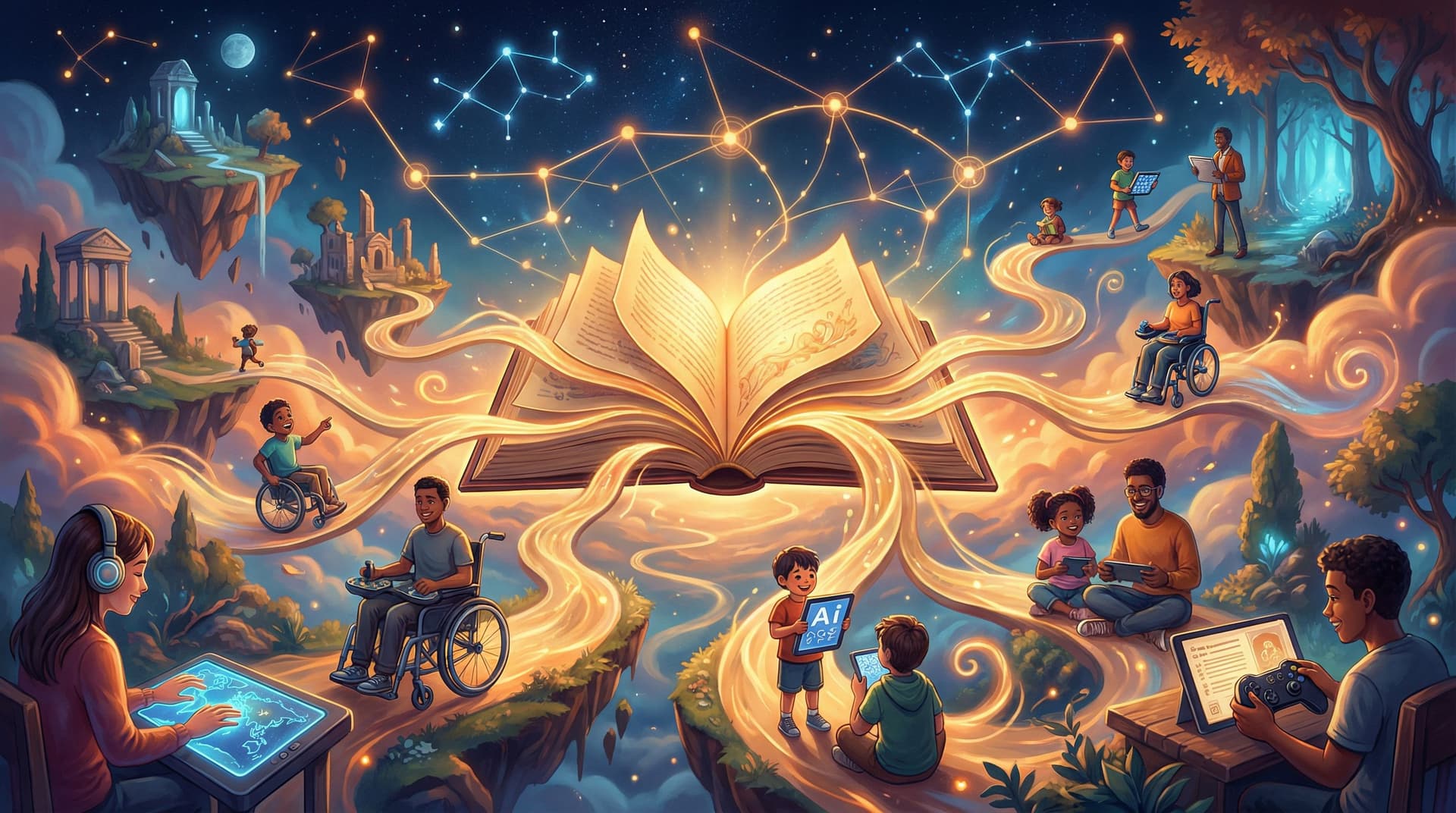
When you build your Questas stories with inclusion in mind, you:
- Create smoother, more enjoyable experiences for everyone
- Reach wider audiences—students, clients, fans, and communities who might otherwise bounce off
- Develop creative muscles that make all your interactive work stronger
Your Next Step
You don’t need to rebuild everything from scratch to start.
Pick one of these to do this week:
- Open an existing Questas project and improve text readability (contrast, size, paragraph breaks).
- Choose one visually rich scene and add or refine image descriptions so someone who can’t see the art still feels the moment.
- Draft a short “Before You Begin” screen that explains playtime, content notes, and accessibility features.
Then, when you build your next adventure, let accessibility guide you from the first node on your story map.
Adventure should be for everyone. You have the tools—now it’s time to design like you mean it.