AI as Art Director: Building Cohesive, On-Brand Visual Languages for Your Questas Series


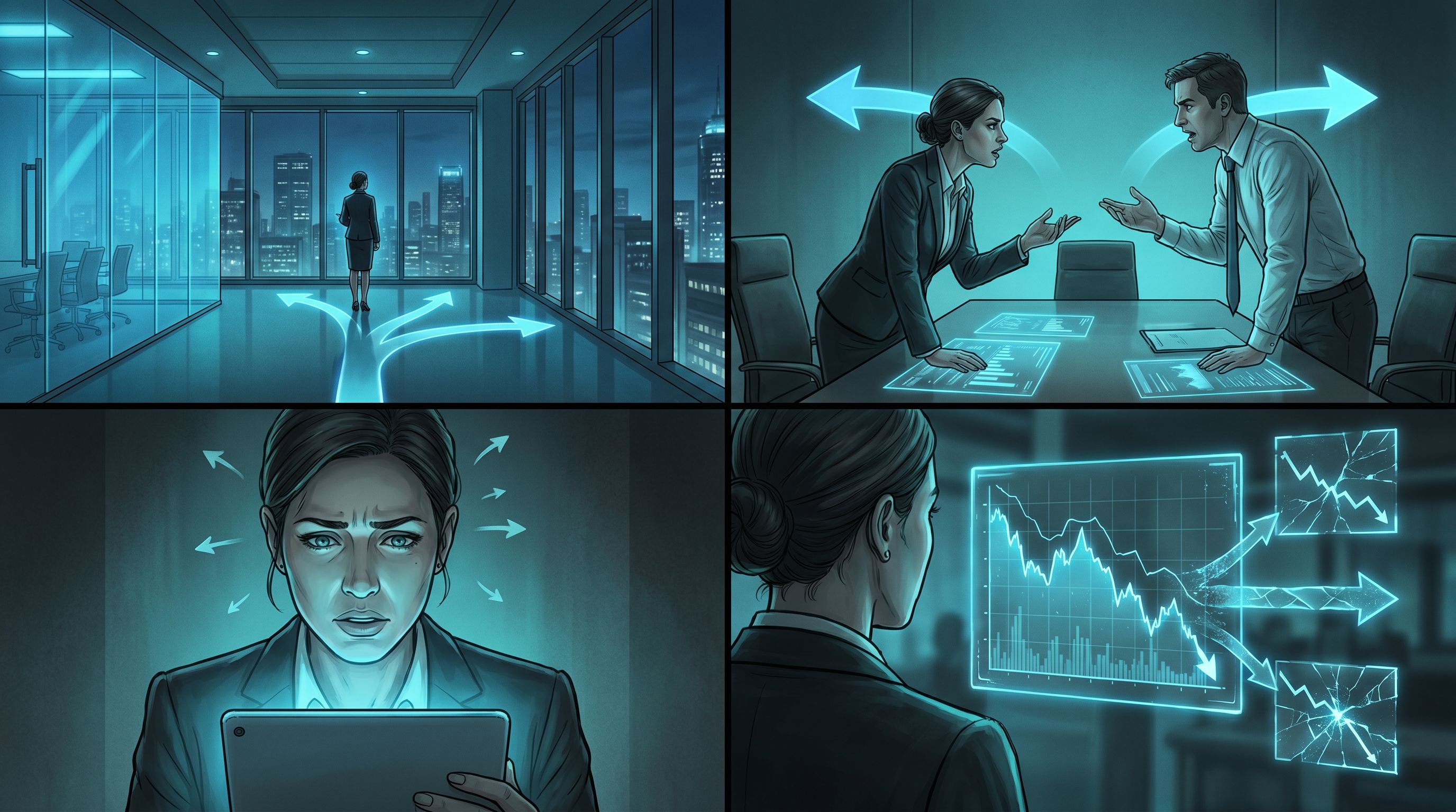
If you’ve ever built a multi‑episode interactive story and thought, “Why does my main character look like a different person every other scene?”, you’ve already met the core challenge of AI visuals: consistency.
When you’re creating a whole series in Questas, you’re not just making isolated images. You’re building a visual language:
- Characters players instantly recognize
- Locations that feel like the same world across episodes
- A mood and style that quietly signals, “You’re still in this universe; your choices still matter here.”
Treating AI as your art director—rather than a random image generator—is how you get there.
In this post, we’ll walk through how to design, document, and maintain a cohesive visual language for your Questas series so that every new branch, episode, and spin‑off still feels unmistakably like your world.
Why Visual Cohesion Matters So Much in Interactive Stories
Visual consistency isn’t just a cosmetic nicety. It directly shapes how players experience your story.
1. Recognition = Emotional Attachment
When a character’s face, posture, and environment stay stable over time, players:
- Form stronger emotional bonds (“That mentor again! I trust them.”)
- Read subtle changes in expression as meaningful
- Remember key scenes and callbacks more easily
If that same mentor looks like a new person every scene, players subconsciously reset their attachment each time.
2. Clarity in a Branching World
Branching narratives already ask players to track:
- Different timelines
- Consequences of past choices
- Alternate versions of the same location or event
A cohesive visual language acts like a compass. Even if the plot branches wildly, the look of your world reassures players that they’re still in the same universe—and that their choices are part of one coherent whole.
If you’re already thinking about replay and alternate routes, this is tightly connected to how you structure your stories. Visual cohesion amplifies the effect of techniques from posts like Designing Replay Value on Purpose, where players revisit scenes and endings multiple times.
3. Trust and Brand Perception
For training, journalism, or B2B scenarios, visual drift can quietly erode credibility:
- A compliance officer looks like three different people across modules
- A flagship product changes color and shape between episodes
- Brand colors vanish in half your scenes
Cohesive visuals tell your audience, “We’re intentional. You can trust this environment.” That’s especially important if you’re using Questas for policy simulations, crisis drills, or customer journeys.
Step 1: Decide What “On‑Brand” Means for This Series
Before you touch prompts, get clear on the creative constraints that define your series.
Think in four layers:
1. World Tone
Is your series:
- Grounded realism – contemporary offices, real cities, natural lighting
- Heightened drama – strong contrast, cinematic framing, moody color grading
- Stylized playfulness – exaggerated proportions, bright palettes, softer edges
- Speculative or surreal – unusual architecture, impossible lighting, symbolic props
Write this down as a 2–3 sentence “tone charter” for the series. Example:
A grounded but slightly cinematic world. Realistic offices and city streets, but with warm, directional lighting and shallow depth of field that makes scenes feel like film stills.
2. Visual Style
Next, decide on:
- Level of realism (photo‑real, painterly, comic, low‑poly, etc.)
- Detail density (clean and minimal vs. richly textured)
- Line and color (thick outlines, no outlines, muted palette, neon accents)
You don’t need art‑school vocabulary. Just pick reference points:
- “Feels like a prestige TV drama still”
- “Like a European graphic novel with flat colors and expressive faces”
- “Like an isometric strategy game screenshot”
3. Brand Anchors
If you’re working with an organization, identify:
- Primary and secondary colors you want to recur (e.g., teal accents on UI, signage, folders)
- Logos or symbols that should appear on badges, screens, or documents
- Accessibility or ethical guidelines (e.g., avoid stereotypical depictions; ensure diverse representation)
For deeper guidance on guardrails, you might pair this with the practices in Ethical AI Worldbuilding.
4. Character and Location Archetypes
List the recurring elements your art direction must support:
- Core characters (protagonist, mentor, antagonist, team, customer)
- Key locations (HQ lobby, starship bridge, training room, newsroom, council chamber)
- Important props (signature device, branded tablet, magical artifact)
You’ll use these lists to build consistent prompts and shot lists later.

Step 2: Turn AI into an Art Director, Not Just an Artist
AI image models are great at one‑off surprises. To turn them into an art director for your Questas series, you need two things: stable prompts and clear feedback loops.
Build a “Prompt Spine” for the Series
A prompt spine is a reusable core phrase you attach to most of your visual prompts.
Example spine:
“cinematic still frame, shallow depth of field, warm directional lighting, 35mm lens, slightly desaturated colors, realistic faces, consistent character design, no text overlay”
Then, for each scene, you add specifics before or after that spine:
- “Middle‑aged Black woman in a navy blazer, thoughtful expression, standing at a glass office wall covered in sticky notes, evening city skyline behind her — cinematic still frame…”
- “Crowded crisis command center with screens showing social media feeds, diverse team leaning over a central table — cinematic still frame…”
Keep the spine as unchanged as possible across:
- Episodes in a series
- Alternate branches of the same scene
- Future spin‑offs in the same universe
Lock in Character Descriptions
For each recurring character, define a prompt template:
- Age range (e.g., “mid‑40s”)
- Ethnicity and notable features
- Usual clothing style
- Signature accessories
- Typical emotional baseline
Example:
“Ava, mid‑40s Latina woman, curly dark hair in a low bun, round glasses, soft but steady gaze, wearing a charcoal blazer over a teal blouse, small silver pendant necklace”
Then, when generating images:
- Always start with that description
- Add pose, emotion, and context: “…Ava, mid‑40s Latina woman… seated at a conference table, leaning forward, concerned expression, late‑night office lighting…”
If your series is large or collaborative, consider building a shared “visual canon” similar to what we cover in The New Visual Writer’s Room.
Standardize Locations and Props
Treat important locations like characters:
- “Company HQ lobby: double‑height space, glass walls, vertical garden, light wood floors, teal reception desk with subtle logo, morning sunlight.”
- “Starship bridge: circular layout, central captain’s chair, panoramic starfield window, teal and charcoal interface panels, soft under‑lighting.”
Re‑use that description every time the location appears. For props, do the same:
- “Handheld device: slim tablet with teal edge glow, no visible brand text, single circular button.”
Use Negative Prompts to Avoid Drift
Most AI tools let you specify what you don’t want. Use that to keep your series clean:
- “no text, no watermarks, no extra limbs, no distorted faces, no exaggerated cartoon style, no logo changes”
Save these as part of your prompt spine.
Step 3: Design a Shot System That Serves the Story
Art direction isn’t only about style—it’s also about camera work. Consistent “cinematography” helps players read scenes quickly.
Define a Small Set of Shot Types
Pick 4–6 shot types you’ll use across the series:
- Wide establishing shot – show the whole location, where we are
- Two‑shot – two characters in frame, relationship dynamics
- Over‑the‑shoulder (OTS) – whose perspective we’re aligned with
- Medium close‑up – emotional beats, key choices
- Insert / detail shot – important prop, screen, or clue
For each type, create a prompt pattern:
- “wide establishing shot of [location description], cinematic still frame…”
- “over‑the‑shoulder shot from behind [character A], looking at [character B] across the desk, cinematic still frame…”
In Questas, you can map these shot types to different nodes:
- Establishing shots for scene entry nodes
- Two‑shots for dialogue and negotiation scenes
- Close‑ups for decision nodes
- Inserts for consequences or clues revealed after a choice
Map Shots to Experience Moments
Think about the function of each image:
- Orientation – Where am I? Who’s here?
- Decision – What emotional weight does this choice carry?
- Consequence – What changed because of my choice?
- Loop / replay – How do I signal we’re revisiting a familiar space?
For example:
- First time in the crisis war room: wide establishing shot
- Later return after a tough decision: same room, but tighter framing, messier table, different lighting to show time and tension
This approach pairs beautifully with techniques from The 5‑Scene Story Lab, where you rapidly test different visual styles and shot choices before committing to a full season.
Step 4: Build a Lightweight Visual Bible for Your Series
A “bible” sounds heavy, but you can keep this lean and practical—especially when you’re moving fast inside Questas.
What to Include
At minimum, capture:
-
Series Overview
- 2–3 sentences on tone and purpose
- Example: “Interactive leadership simulations for new managers, set in a realistic but slightly cinematic tech company. Focus on ethical decisions under pressure.”
-
Style Sheet
- Prompt spine
- Negative prompts
- Sample images that represent the gold standard
-
Character Sheets
- Name, role, visual description
- 2–3 reference images per character
- Notes on typical emotions and posture
-
Location Sheets
- Key spaces with descriptions and sample images
- Notes on time‑of‑day variations
-
Brand & Ethics Guidelines
- Color accents
- Representation goals
- Content boundaries (e.g., no graphic violence, how to handle sensitive topics)
Where to Keep It
Use whatever your team already uses:
- A shared doc or wiki
- A dedicated folder inside your Questas project with “reference” nodes
- A lightweight Notion or Google Doc with copy‑pastable prompts
The goal is frictionless reuse. When someone adds a new branch, they should be able to:
- Grab the character template
- Grab the location template
- Paste in the prompt spine
- Generate a consistent new image in minutes
Step 5: Use Questas as a Visual QA and Iteration Engine
Once your first pass of visuals is in place, don’t stop at “good enough.” Use your story itself as a test harness.
Do a “Visual Continuity Run”
Play through your quest purely as a visual reviewer:
- Ignore text; focus only on images
- Ask on each node:
- Does this character look like themselves?
- Does this location match previous appearances?
- Is the style, color, and lighting consistent?
- Does the shot type fit the narrative moment?
Take quick notes on nodes that break the visual language. Then batch‑regenerate those images using your prompt spine and templates.
Collect Player Screenshots as Feedback
Encourage early testers to screenshot moments that:
- Feel especially on‑brand and immersive
- Break immersion because of visual drift or oddities
Over time, you’ll see patterns:
- A particular character description that keeps drifting
- A location that’s under‑specified in prompts
- A shot type that confuses rather than clarifies
Use those patterns to refine your visual bible and prompt spine.
Iterate Between Episodes
If you’re building a series of episodes or modules:
- After episode 1, lock in what worked visually: paste those prompts into your bible
- For episode 2, start from that baseline and make small, intentional evolutions (e.g., darker lighting as stakes rise)
This keeps your universe coherent while still allowing growth and tonal shifts.
Step 6: Align Visual Language with Mechanics and Learning Goals
For many Questas creators, visuals aren’t just decoration—they’re part of how people learn or make sense of complex systems.
Use Visuals to Signal Choice Types
If you’re designing different kinds of decisions (risky vs. reflective vs. routine), your visual language can reinforce that:
- Risky choices – higher contrast lighting, tighter close‑ups, more dynamic angles
- Reflective choices – softer lighting, slightly pulled‑back framing, more environmental detail
- Routine choices – neutral lighting, stable camera angles, consistent backgrounds
That way, players feel the difference between “this is a high‑stakes call” and “this is everyday practice,” even before they read the options.
Make Consequences Visually Legible
When a choice changes the world:
- Show the same location from a similar angle, but with clear differences (e.g., calm vs. chaotic war room; happy vs. frustrated customer)
- Keep the character design identical so the contrast is in expression and environment, not identity
This is especially powerful in:
- Policy or compliance simulations
- Crisis drills
- Customer journey explorations
Wherever the difference between two futures matters, visuals should make that difference obvious.
Bringing It All Together
When you treat AI as an art director for your Questas series, you’re really doing three things:
- Defining a clear visual language – tone, style, characters, locations, brand anchors.
- Encoding that language into prompts and templates – prompt spines, character/location descriptions, shot patterns.
- Protecting and evolving that language over time – visual bibles, continuity passes, player feedback.
The payoff is huge:
- Players recognize your world instantly—even across new episodes and spin‑offs.
- Branches feel like alternate paths, not alternate universes accidentally mashed together.
- Your brand, message, or learning goals land more cleanly because the visuals are pulling in the same direction as the narrative.
Where to Go Next
If you’re ready to level up your visual storytelling craft:
- Explore how to build a shared canon and prompt library with your team in The New Visual Writer’s Room.
- Experiment with small, focused builds to test visual styles and shot systems using the approach in The 5‑Scene Story Lab.
- Revisit your existing quests and ask: What visual language are they already speaking—and how can I make it more intentional?
And if you haven’t yet tried building with Questas, this is an ideal moment to start. Pick a tiny scenario—a single tough decision, a short customer moment, or a scene from your tabletop campaign—and:
- Draft a one‑paragraph tone charter.
- Write a simple prompt spine.
- Define one character and one location template.
- Build a 3–5 node mini‑quest to test that visual language.
You don’t need a full season planned to begin. You just need one scene where your world finally looks like it does in your head.
Adventure awaits—let your AI art director help you bring it to the screen.


