AI Visual Etiquette: Avoiding Tropes, Stereotypes, and Overload in Image-Heavy Questas Stories


Interactive stories are no longer just text with the occasional illustration. With AI image and video tools built directly into platforms like Questas, it’s easier than ever to turn every node of your branching narrative into a richly rendered scene.
That power comes with a responsibility: how you use visuals shapes how players feel, who they see themselves as, and whether they want to keep going. Thoughtful visual choices can:
- Deepen immersion and emotional impact
- Make complex branches easier to follow
- Help players feel seen, respected, and included
Careless choices, on the other hand, can:
- Lean on lazy stereotypes (especially around race, gender, age, and disability)
- Overwhelm players with noisy, inconsistent imagery
- Undercut the tone of your story or training scenario
This post is a practical guide to AI visual etiquette for creators building image‑heavy stories in Questas. You’ll learn how to avoid common tropes, design inclusive casts, and keep your visuals doing narrative work instead of just adding clutter.
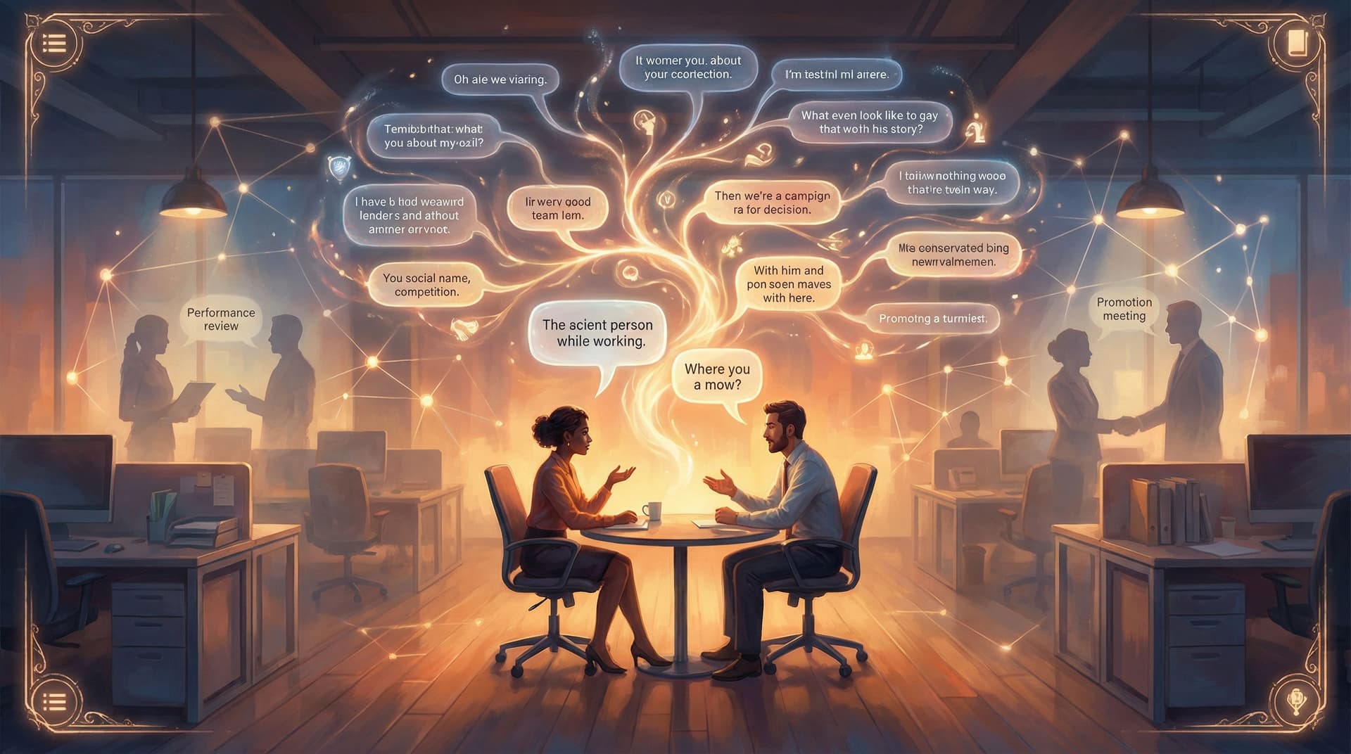
Why Visual Etiquette Matters in Branching Stories
In a linear book, a problematic illustration is a single bad moment. In a branching story, visuals repeat across paths, endings, and replays. A stereotype that appears in one scene can echo dozens of times as players explore different branches.
A few reasons to care deeply about this:
-
Players read images faster than text. Visuals are often the first thing a player processes when a scene loads. They set expectations about who matters, who has power, and what kind of world this is before your dialogue even appears.
-
Branching structures amplify patterns. If every authority figure your AI generates is a white man in a suit, or every caregiver is a woman, players notice the pattern—especially in replay-heavy training stories like “Office Politics, But Make It Playable”.
-
Visuals are how you teach your world’s rules. In complex universes or branded experiences, images quietly communicate what “belongs.” That’s powerful when you’re turning brand systems into story bibles, as explored in “From Brand Guidelines to Story Bible”, but dangerous if the rules you’re encoding are biased.
-
AI models are trained on biased data. Left unprompted, many image models default to familiar clichés: thin bodies, Western beauty standards, male-coded leadership, exoticized cultures. Good etiquette means actively steering away from those defaults.
-
Overload kills clarity. Even if every image is ethically fine, too many visuals—or visuals that fight each other stylistically—can make your story harder to follow and emotionally flatter.
Visual etiquette isn’t about being “perfectly correct.” It’s about being intentional: designing your images to support your story, your players, and your goals.
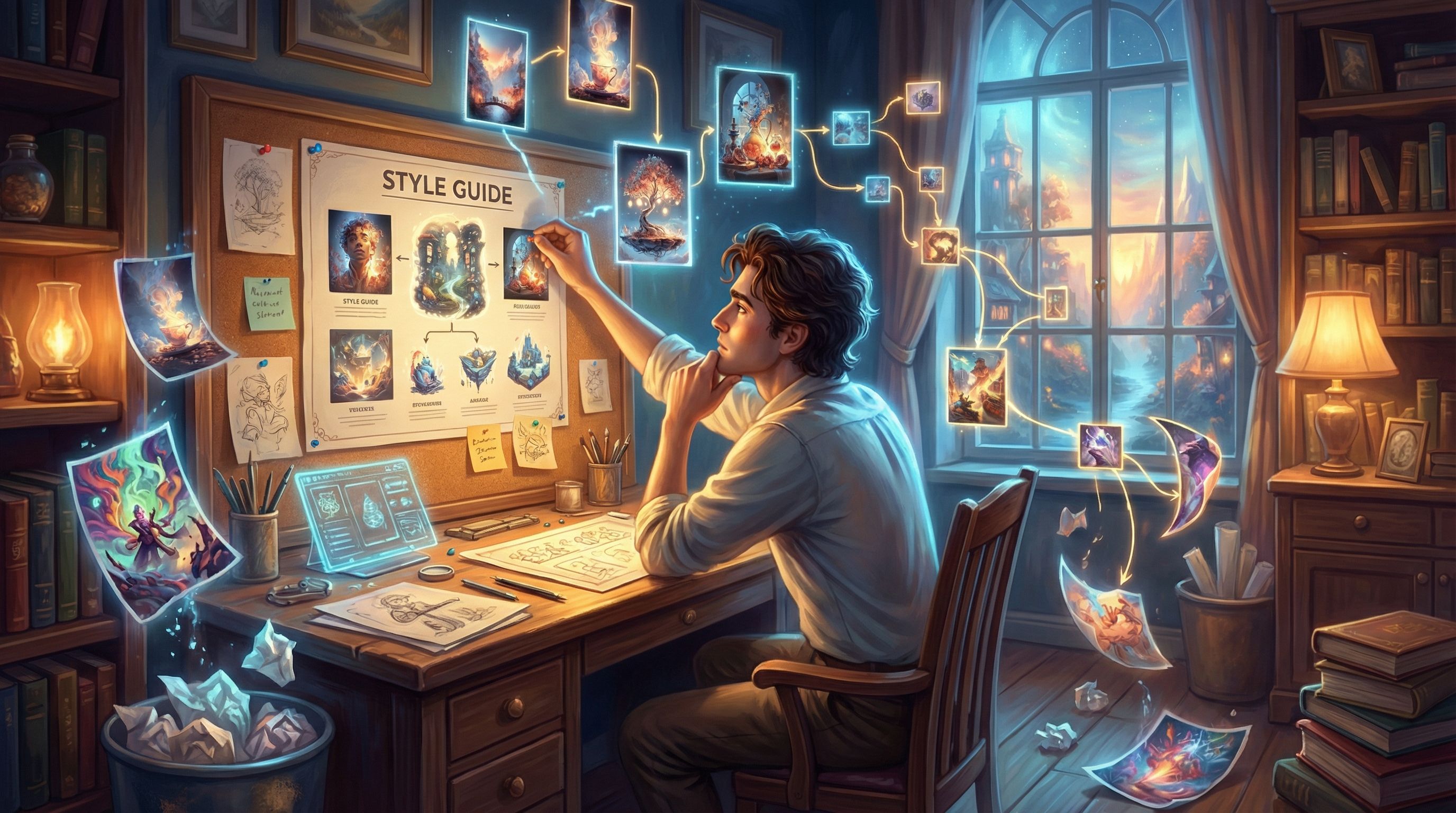
Start With a Visual North Star, Not Random Prompts
The worst time to think about ethics and aesthetics is after you’ve already generated 200 images.
Instead, define a visual North Star before you open your AI tool:
- Tone: Is this story playful, grounded, eerie, corporate, surreal, or cozy?
- Camera feel: Are we tight on faces and emotions, or pulled back to show systems and environments?
- Level of realism: Photorealistic, painterly, cel‑shaded, sketchy, low‑poly, or collage‑like?
- Color language: Muted neutrals, high‑contrast neons, warm earth tones, or strict brand palette?
In Questas, you can reflect this North Star by:
- Writing a short visual style paragraph in your project notes
- Reusing a consistent prompt scaffold across scenes
- Saving example references in your “world” or project documentation
A simple scaffold might look like:
“Cinematic, soft lighting, mid‑shot of characters, painterly style with warm earth tones, diverse cast, grounded contemporary setting, subtle background details that hint at [theme].”
Use this scaffold as the backbone of every prompt, only swapping in the specifics of the scene.
Spotting and Avoiding Common Visual Tropes
AI models tend to repeat patterns they’ve seen thousands of times. If you’re not careful, your story inherits those patterns.
Here are some of the most common tropes to watch for—and how to counter them in your prompts.
1. The Default Protagonist
The trope: A young, thin, conventionally attractive, usually white hero, even if your text never specified this.
What to do instead:
- Specify identity only when it serves the story. Don’t “collect” identities for flavor. If race, disability, or gender is relevant, name it clearly and respectfully.
- Vary protagonists across branches or scenarios. In training or education stories, consider rotating who the player “inhabits,” as you might in “Branching Narratives for Therapists and Coaches”.
- Prompt for diversity thoughtfully:
- "Middle‑aged Black woman software engineer leading a meeting"
- "Queer South Asian nonbinary therapist in a cozy office, wheelchair visible, warm expression"
2. Exoticizing Non‑Western Settings
The trope: Any non‑Western location becomes hyper‑saturated, mystical, or “othered”—temples in the mist, crowded bazaars, random lanterns.
What to do instead:
- Ground scenes in real, everyday details. Think public transit, offices, apartments, cafes, not just monuments and markets.
- Avoid generic “ethnic” mashups. Be specific: “modern Lagos tech hub” is better than “futuristic African city.”
- Ask: would I be comfortable showing this to someone from that place and saying, ‘This represents you’?”
3. Gendered Roles by Default
The trope: Men as leaders, women as assistants or caregivers, nonbinary people invisible.
What to do instead:
- Flip defaults deliberately:
- Women and nonbinary people as CEOs, engineers, commanders
- Men as caregivers, teachers, nurses, stay‑at‑home parents
- Prompt for role first, then identity:
- "Company CFO, late‑50s Latina woman, calm and analytical"
- "Stay‑at‑home dad in his 30s, cooking with toddler in a small kitchen"
4. Disability as Tragedy or Superpower
The trope: Disabled characters are either inspirational mascots or tragic side stories.
What to do instead:
- Normalize disability as part of everyday life. Wheelchairs in offices, hearing aids in classrooms, white canes on city streets.
- Avoid “fixing” disability through magic or tech unless your story interrogates it.
- Prompt for agency: “Blind lawyer reviewing documents with screen reader, confident posture,” not “sad blind person in darkness.”
5. Monolithic Body Types
The trope: Everyone is thin, muscular, and within a narrow age band.
What to do instead:
- Intentionally vary body types, ages, and faces. Name these in prompts: “fat,” “plus‑size,” “wrinkled,” “bald,” “freckled,” “acne,” “prosthetic leg.”
- Avoid euphemisms that push models back to thinness (e.g., “curvy” often still yields hourglass figures).
Build a quick “trope audit” checklist for your project:
- Who gets to be a hero?
- Who gets to be in charge?
- Who is shown as vulnerable or in need of help?
- Which identities are invisible so far?
Run this audit every time you add a new batch of images in Questas.
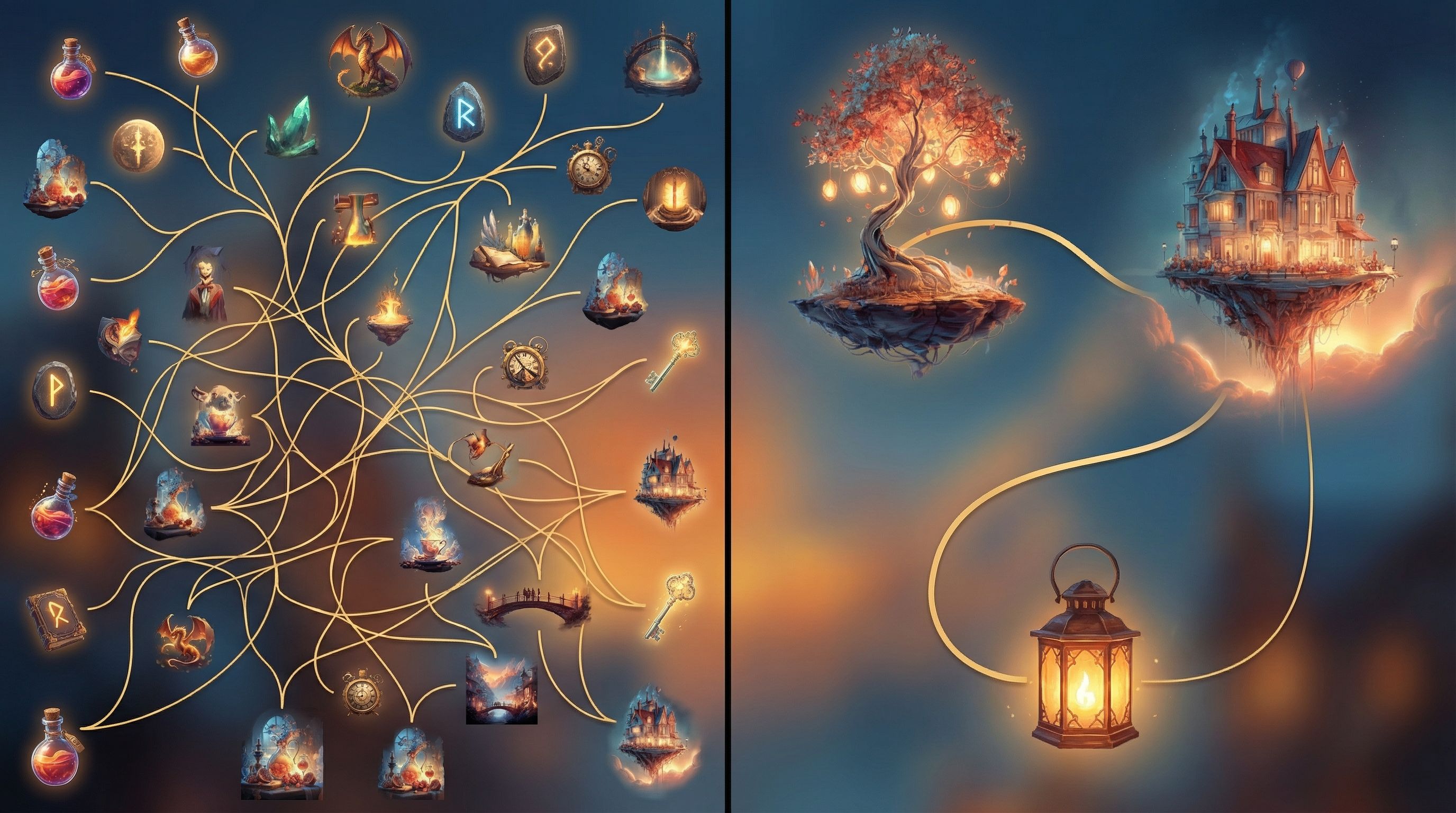
Designing a Cast That Feels Real and Reusable
A powerful way to avoid stereotypes is to design a coherent ensemble instead of one‑off characters per scene. If you haven’t yet, read “AI as Casting Director: Designing Reusable Character Ensembles” for a deeper dive.
For etiquette purposes, focus on three principles:
-
Cast for the whole story, not just this scene.
- Map your main and recurring characters.
- Decide on their roles, identities, and arcs before you prompt images.
-
Give each character at least one trait that pushes against stereotype.
- The tough security chief who loves gardening
- The elderly mentor who’s obsessed with VR games
- The teenage character who uses a wheelchair and leads the robotics club
-
Keep visual continuity across branches.
- Reuse the same character description in prompts: “short Black woman in her 40s with silver streak in curly hair, round glasses, navy blazer.”
- In Questas, store these descriptions in a character sheet and reference them whenever you generate new scenes.
When your cast feels like real people with inner lives, it’s much harder to slip into shallow visual clichés.
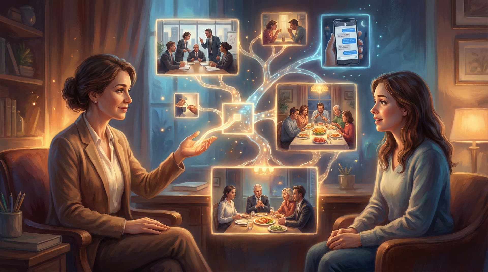
Calibrating How Many Images You Actually Need
More images are not always better. The right number depends on:
- Story length and complexity
- Player device (mobile vs desktop)
- Cognitive load of your content (e.g., emotional training vs light entertainment)
A simple rule of thumb:
- Anchor images for major beats: new locations, key decisions, emotional turning points
- Minimal or no images for dense explanation, reflection, or inner monologue
- Recurring motifs instead of brand‑new art for every node (e.g., the same “office hallway” shot for many transitions)
Ask yourself at each node:
“Is this image doing narrative work, or is it just decoration?”
If it’s not clarifying something—tone, stakes, relationships, setting—you can probably skip it.
Making Images Serve Choices, Not Distract From Them
In branching stories, every decision point is a moment of tension. Visuals should heighten that tension, not bury it.
Borrowing from ideas in “The Tension Triangle: Balancing Risk, Reward, and Information in Each Questas Choice Point”, think of each image as part of the information side of the triangle.
To keep visuals serving choices:
-
Align the image with the key dilemma.
- If the choice is about trusting a character, focus on their expression and body language.
- If it’s about environment risk, show the hazard clearly.
-
Avoid visual spoilers.
- Don’t reveal the monster in full detail before the “open the door vs walk away” choice.
- Suggest danger with lighting, silhouettes, or partial views.
-
Keep composition simple around high‑stakes choices.
- Limit busy backgrounds.
- Use framing (doorways, windows, spotlights) to guide the eye.
-
Use recurring visual motifs as “tutorials.”
- A certain color glow always indicates a risky but rewarding option.
- A particular symbol marks choices that affect long‑term relationships.
When you prototype in Questas, play through your story once focusing only on how images feel at choice points. If you find yourself squinting at art instead of thinking about the decision, simplify.
Building a Lightweight Review Process for Visual Ethics
You don’t need a formal ethics board to improve your visuals. A simple, repeatable review loop goes a long way.
Step 1: Batch, Don’t Trickle
Generate images in small, coherent batches:
- All scenes in one location
- All scenes featuring a specific character
- All images for a particular branch
This makes patterns easier to spot.
Step 2: Run a Quick Bias Scan
For each batch, ask:
- Who’s missing?
- Who’s always in charge?
- Who’s always in trouble or being rescued?
- Is any culture reduced to costume or backdrop?
If you see a pattern, adjust prompts and regenerate the outliers.
Step 3: Get at Least One Outside Perspective
If possible, share a preview build of your Questas story with someone who:
- Shares an identity represented in your story, or
- Has experience in DEI, accessibility, or inclusive design
Ask them to focus specifically on visuals:
- “Where did an image pull you out of the story?”
- “Where did you feel flattened into a stereotype?”
- “Where did you feel pleasantly surprised or seen?”
Step 4: Document and Reuse Your Standards
Turn your learnings into a mini visual code of conduct for your future projects:
- Phrases you like to use in prompts
- Tropes you explicitly avoid
- Examples of “good” vs “needs work” images
If you’re working with a brand team, this can sit alongside your interactive brand bible, like the ones discussed in “Interactive Brand Bibles: Turning Style Guides into Questas Adventures Your Team Will Actually Use”.
Practical Prompt Patterns You Can Steal
To make this concrete, here are some plug‑and‑play prompt patterns you can adapt. Swap in your own setting, roles, and tones.
Inclusive workplace scene
“Candid mid‑shot of a diverse product team in a small open office, late‑20s to 50s, mix of genders and body types, Black woman in her 40s leading the discussion at a whiteboard, East Asian nonbinary designer with short hair taking notes on a laptop, man with prosthetic arm leaning on the table, casual clothing, warm natural light, painterly style, soft focus background.”
Non‑exoticized city street
“Everyday street scene in São Paulo, overcast afternoon, people in modern casual clothing walking dogs, waiting at a bus stop, small shops with contemporary signage, realistic proportions, no tourist clichés, cinematic but understated color palette, slight grain.”
Tense conversation training scenario
“Two colleagues in a quiet meeting room, mid‑30s Black man in a button‑down shirt looking conflicted, late‑20s white woman manager listening attentively, neutral background, soft overhead light, subtle reflections on glass wall, focus on facial expressions and body language, semi‑realistic illustration style.”
Hero who breaks default molds
“Fat nonbinary protagonist in their 30s with short curly hair and glasses, wearing a practical jumpsuit and tool belt, standing confidently at the edge of a spaceship hangar, wheelchair visible beside them, stars in the distance, stylized sci‑fi illustration, cool blue and purple tones.”
Store your best patterns inside your Questas project docs so future you (or your collaborators) can keep building on them.
Bringing It All Together
Thoughtful AI visual etiquette is less about policing yourself and more about craftsmanship:
- You define a clear visual North Star so your story feels coherent.
- You spot and disrupt common tropes before they calcify into your cast.
- You design a real ensemble, not a parade of stereotypes.
- You calibrate image density so visuals support, rather than smother, your narrative.
- You align images with choices, making decisions feel sharper and more meaningful.
- You build a simple review loop so your work gets a little more inclusive with every project.
When you do this consistently, players may not be able to name what you’ve done—but they’ll feel it. They’ll stay longer, explore more branches, and recommend your story not just because it looks cool, but because it feels like a world that has room for them.
Your Next Step
If you’re already building on Questas, pick one story and:
- Choose a short scene cluster—5–10 nodes.
- Run a quick visual audit using the questions above.
- Regenerate just three images that feel the most trope‑y or overloaded.
- Note what changed in how the scene feels.
If you haven’t started yet, this is an ideal moment to:
- Sketch your first branching outline
- Draft a one‑paragraph visual North Star
- Experiment with a small, inclusive character ensemble
Then log into Questas, spin up a new project, and build a tiny, image‑aware prototype. You don’t need a full epic to start practicing good visual etiquette—you just need one scene where your images and your ethics are pulling in the same direction.