AI as Art Director: Building Cohesive Visual Storyworlds in Questas Without a Design Team

Interactive stories live or die on how they feel as a world.
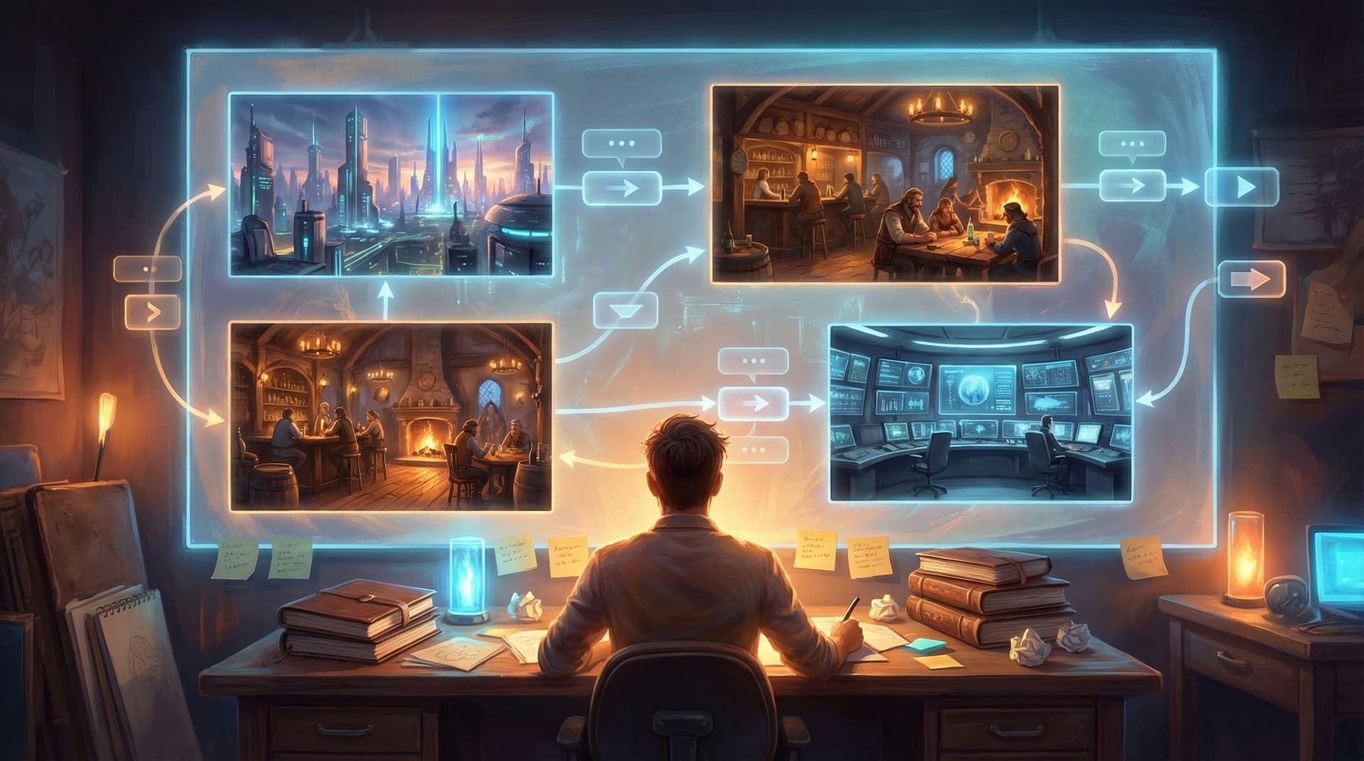
You can have sharp dialogue and clever branches, but if your visuals jump from painterly fantasy to glossy 3D to flat cartoons, players feel like they’re hopping between different universes. That’s distracting in a linear comic; in a branching experience, it can be fatal. People stop trusting the world, and once that trust goes, immersion goes with it.
The good news: you don’t need a studio art department to keep your storyworld visually tight.
With AI image and video generation built into tools like Questas, you can treat the model itself as your art director—if you give it the right constraints, references, and workflows. Think less “magic button,” more “junior artist who’s incredibly fast but needs clear direction.”
This post walks through how to:
- Define a visual identity for your world in under an hour
- Turn that identity into reusable prompt systems
- Keep characters, locations, and moods consistent across branches
- Use Questas’ visual editor to enforce cohesion scene by scene
- Avoid common AI-art pitfalls that break immersion
Whether you’re a solo creator, a learning designer, or part of a product team, you’ll be able to build storyworlds that look like they came from a unified vision—without hiring a design team.
Why Visual Cohesion Matters So Much in Interactive Stories
In a branching story, players are constantly testing the edges of your world:
- What happens if I choose this?
- Is this character really who they say they are?
- Does this place still feel like the same city, forest, spaceship… even on a different path?
Visual consistency quietly answers those questions.
When your visuals are cohesive:
- Players trust the world. The same character looks like themselves in every scene, so choices feel like they’re affecting one continuous reality.
- Branches feel like alternate timelines, not alternate productions. Different outcomes, same aesthetic.
- You can communicate story information faster. Color, lighting, and composition signal mood and stakes without extra text.
- Your work looks “expensive.” Even if every image is AI‑generated, a consistent style reads as intentional, not random.
If you want a deeper dive into why consistency matters across multiple quests, check out From Style Transfer to Story Consistency: Advanced AI Visual Workflows for Questas Creators after this post—it pairs well with what you’re about to design here.
Step 1: Define Your Storyworld’s Visual Bible (In One Page)
Before you touch prompts, you need a simple visual bible—a one‑page guide to how your world should look and feel.
You don’t need formal design training. You just need to make a few decisions and write them down where you’ll see them while building in Questas.
1. Choose a Primary Visual Style
Pick one main style you’ll commit to for the whole quest:
- Painterly / illustration – soft edges, visible brush strokes, storybook or concept‑art feel
- Anime / manga‑inspired – clean lines, expressive faces, stylized proportions
- Semi‑realistic / cinematic – detailed lighting, realistic anatomy, film still vibes
- Graphic / flat – bold shapes, limited shading, poster‑like compositions
Write a simple sentence like:
“This story is semi‑realistic, cinematic, with soft lighting and natural color grading.”
That sentence will anchor your prompts later.
2. Lock in a Color & Lighting Palette
Pick 2–3 dominant colors and 1–2 accent colors that match your story’s tone.
- Cozy fantasy tavern mystery → warm ambers, browns, soft teal accents
- Corporate security training → cool blues, neutrals, one strong accent like orange for warnings
- Sci‑fi rebellion → deep blues, neon magentas, high‑contrast shadows
Then define your default lighting:
- Soft morning light
- Harsh overhead office fluorescents
- Neon at night with strong rim light
Document it:
“Dominant colors: cool blues and grays, with orange accent for danger or alerts. Lighting: mostly soft, natural office lighting; sharp contrast only in high‑tension scenes.”
3. Decide on Character Design Rules
For your main cast, define:
- Age range & body types (e.g., late 20s, athletic; 50s, soft build)
- Signature features (scar, hairstyle, glasses, tattoos, uniform pieces)
- Wardrobe baseline (casual streetwear, medieval armor, startup office, hospital scrubs)
You’ll turn this into reusable prompt fragments later.
4. Choose a Camera & Framing Language
Pick how your “camera” usually sits:
- Medium shots for dialogue scenes
- Close‑ups for emotional beats
- Wide shots for establishing locations and big choices
Writing this down helps you avoid jarring jumps from extreme close‑up to birds‑eye view with no reason.
“Default framing: medium shots for dialogue, occasional close‑ups for key choices, wides only for new locations or big reveals.”
Put all of this in a short doc or a pinned note next to your Questas project. That’s your visual bible.
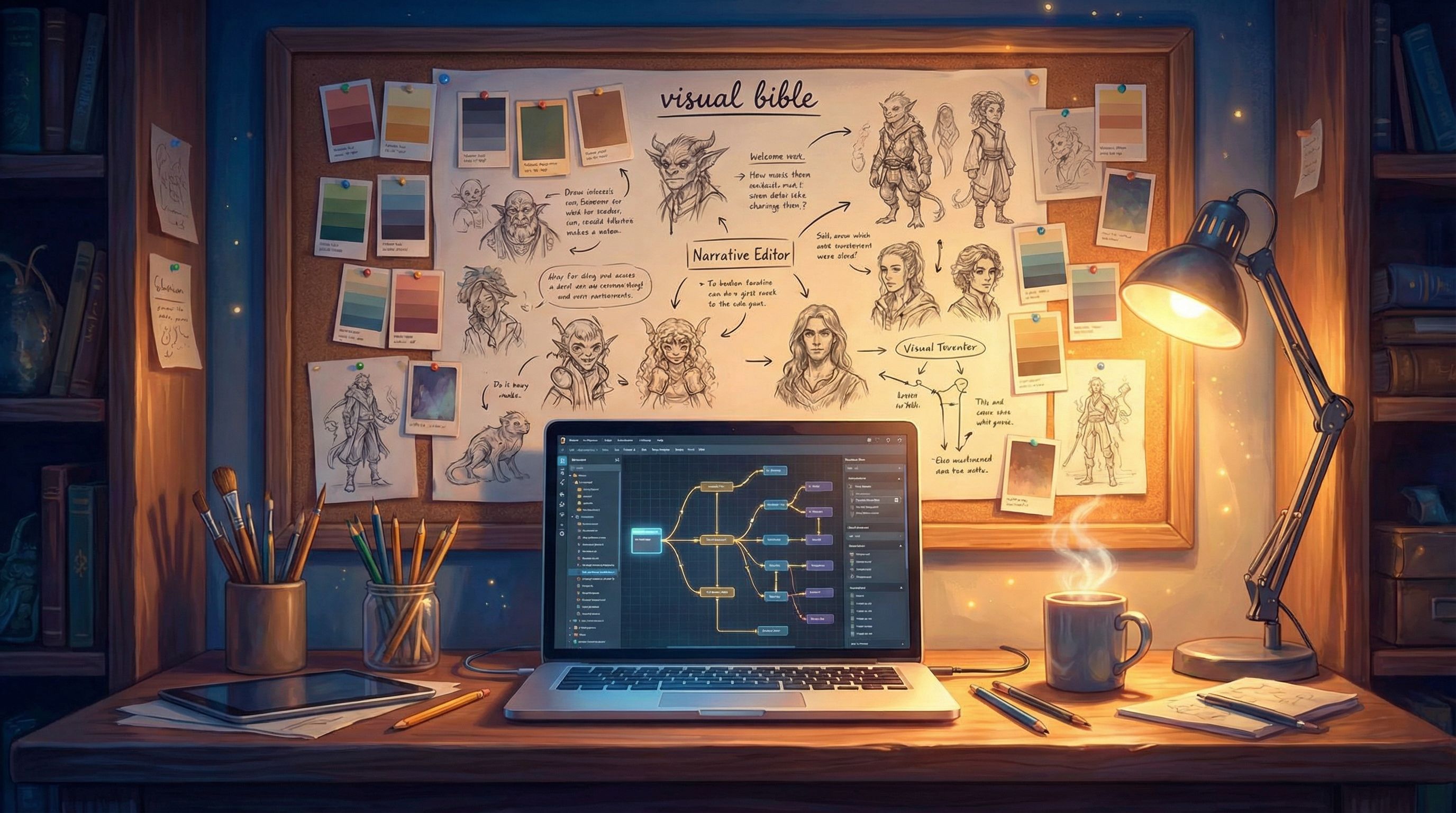
Step 2: Turn AI Into Your Art Director With Prompt Systems
Once you have a visual bible, you can stop improvising prompts and start using prompt systems—modular building blocks you reuse across scenes.
Think of it as giving your AI art director a style guide instead of shouting new instructions every time.
1. Build a Reusable Style Block
Create a base style phrase you’ll paste into every prompt:
“semi‑realistic cinematic illustration, soft natural lighting, cool blue and gray palette with orange accents, consistent character design, 16:9 aspect ratio”
This ensures the model aims for the same overall look every time.
2. Create Character Prompt Templates
For each main character, write a reusable description:
-
Name: Mara, the security analyst
-
Prompt block:
“Mara, late 20s security analyst, brown skin, tight curls in a low bun, round glasses, navy blazer over a white shirt, subtle under‑eye circles, calm but alert expression”
Then your scene prompts become:
“Mara, late 20s security analyst, brown skin, tight curls in a low bun, round glasses, navy blazer over a white shirt, subtle under‑eye circles, calm but alert expression, standing in a dim server room surrounded by blinking lights, semi‑realistic cinematic illustration, soft natural lighting, cool blue and gray palette with orange accents, 16:9 aspect ratio”
Copy‑pasting that block every time is the secret to characters staying recognizable across branches.
3. Make Location & Mood Blocks
Do the same for key locations:
- “Open‑plan startup office, glass walls, rows of monitors, potted plants, muted blue and gray palette, evening light through windows”
- “Underground command bunker, concrete walls, low ceiling, red emergency lights, cluttered desks with maps and laptops”
And mood/intensity modifiers:
- “low tension, relaxed posture, warm lighting”
- “high tension, harsh shadows, strong contrast, dramatic composition”
Now you can assemble prompts like LEGO:
Character block + Location block + Mood block + Style block
4. Save These Blocks Where You Build
Inside Questas, keep these blocks handy:
- In a dedicated “Visual Bible” scene that you don’t show to players
- In a notes field or external doc you can alt‑tab to
- As reusable templates if your team uses No-Code Narrative Systems
The goal: you never write a prompt from scratch. You assemble it from your system.
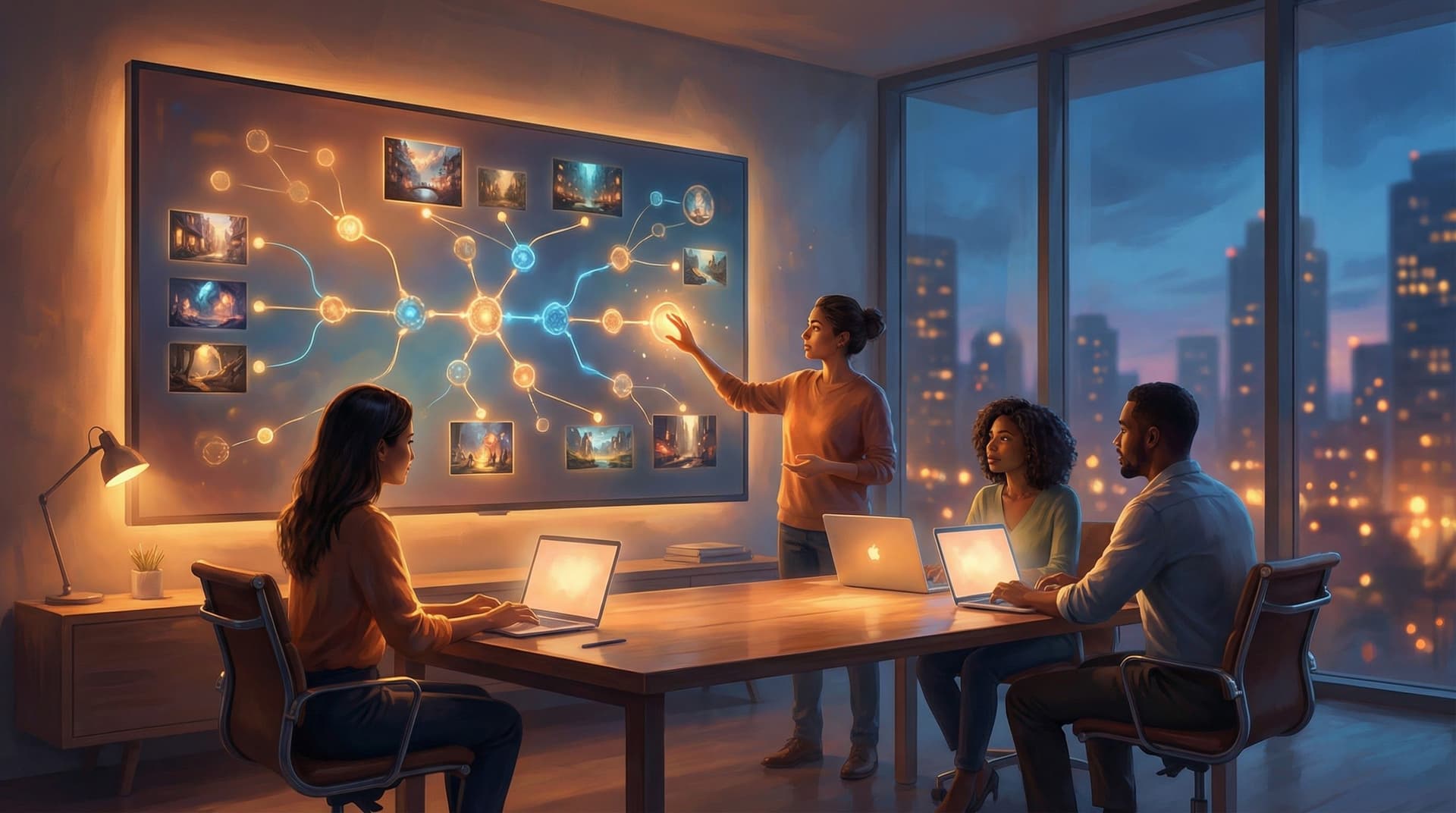
Step 3: Use Questas’ Structure to Enforce Visual Consistency
The visual, no‑code editor in Questas is more than a canvas for scenes; it’s a map of where consistency can break. You can use that structure to your advantage.
1. Define Visual “Lanes” for Each Branch
Look at your branching graph and identify:
- Core spine scenes – the main through‑line most players see
- Side branches – optional paths, detours, or what‑ifs
- End states – outcomes, fail states, or epilogues
Give each type a slightly different visual treatment within your overall style:
- Core spine → your default palette and lighting
- Side branches → same style, but maybe one extra color accent or slightly different framing
- End states → more dramatic lighting or composition, but still using the same characters and base style
This way, players can feel where they are in the story without the experience turning into a visual mash‑up.
If you’re interested in how visual consequences can shape behavior, pair this with Visual Fail States: Using AI Imagery to Signal Risk, Reward, and Consequences in Questas once you’re done here.
2. Reuse and Remix, Don’t Regenerate From Scratch
Whenever possible:
- Duplicate a scene’s image and make small prompt tweaks instead of generating a totally new one.
- Keep camera angle and composition similar when a scene represents “the same moment, different choice outcome.”
- For alternate branches, change lighting and expression before you change style.
This reinforces that branches are variations of a shared reality, not separate universes.
3. Check Consistency in “Story Mode,” Not Just Scene by Scene
It’s easy to fall in love with individual images. The real test is how they feel in sequence.
Before you ship:
- Play through each major path in Questas as if you’re a new player.
- Ask on every transition:
- Does this still look like the same world?
- Does the character clearly look like themselves?
- Did the mood shift too hard or not enough?
- Jot down any scenes where the style suddenly changes or a character’s face looks off.
- Regenerate just those with tighter prompts (or by copying a successful prompt from a nearby scene).

Step 4: Keep Characters Recognizable Across Dozens of Scenes
Character drift is one of the biggest immersion killers in AI‑assisted stories. Here’s how to fight it.
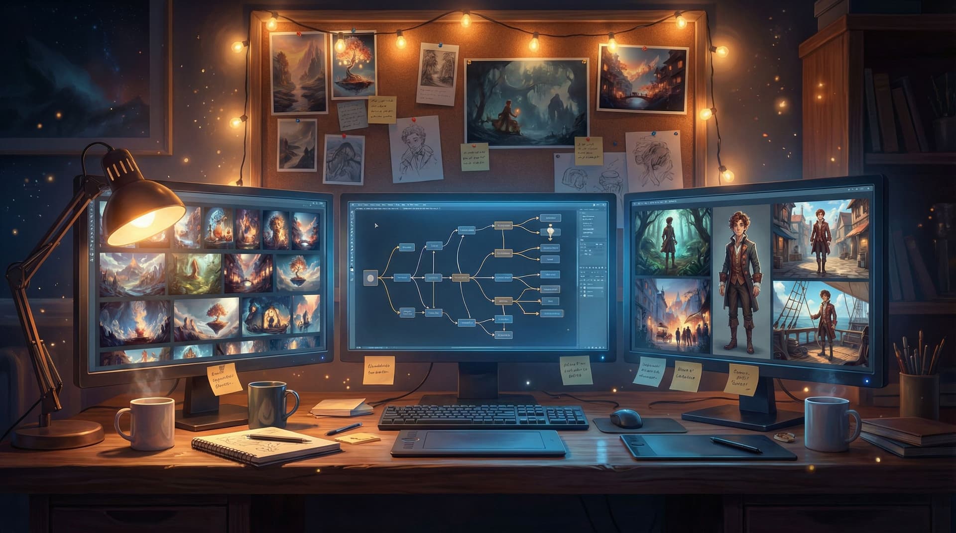
1. Start With a “Model Sheet” Pass
Before you build your full quest:
- Generate 3–5 images of each main character:
- Neutral expression, standard outfit
- Happy/excited
- Worried/tense
- Angry or determined
- In motion (running, gesturing, working)
- Put them side by side and tweak prompts until you’re happy that they all read as the same person.
- Save the exact character description that produced the best set.
These become your internal reference images. Even if players never see them all, you know what “on‑model” looks like.
2. Anchor Prompts to the Face and Silhouette
When describing characters, emphasize:
- Face shape, hair, and distinctive features
- Body type and posture
- One or two signature clothing items
For example:
“tall, broad‑shouldered man with a shaved head and a neatly trimmed beard, wearing a bright yellow hoodie and black cargo pants”
Those elements make it easier for the model to stay consistent—even when you change settings or lighting.
3. Use Soft Variations Instead of New Descriptions
When you need a different outfit or context, add to your base description instead of replacing it:
- ✅ “Mara, same as before, but now wearing a dark green raincoat over her blazer, hair slightly frizzed from the storm”
- ❌ “Young woman in a raincoat, standing outside in the rain”
The first keeps the anchor; the second invites drift.
Step 5: Use Visual Rhythm to Support Story Rhythm
Visual cohesion isn’t just about style; it’s also about when and how you change the look.
If every scene is composed and lit the same way, your story will feel flat—even if the style is consistent. You need rhythm.
A simple pattern to start with (and one that pairs nicely with From Branches to Beats: Using Story Rhythm to Keep Players Clicking in Long Questas):
- Establish: Wide shot of a new location → give players context
- Engage: Medium shots for conversations and choices
- Intensify: Gradually tighten to close‑ups as stakes rise
- Release: Pull back to wider shots after big decisions or reveals
You can mirror this visually with:
- Slight shifts in color temperature (cooler in tension, warmer in resolution)
- Stronger contrast at key decision points
- More negative space when you want players to pause and think
Because you’re building in Questas, you can lay scenes out on the canvas and literally see where your story might be visually monotonous. If three high‑tension nodes sit in a row, make sure their images aren’t all the exact same framing and lighting.
Step 6: Common Pitfalls (and How to Avoid Them)
Even with a solid system, a few traps show up over and over. Watch for these:
1. “Style of the Day” Temptation
You discover a cool new aesthetic halfway through—watercolor, pixel art, hyper‑real photography—and want to switch.
- Fix: Save experiments for the next quest. For the current one, keep the main style locked and maybe let the new style appear only in in‑world artifacts (posters, screens, dreams) with a clear narrative reason.
2. Over‑detailed Prompts That Fight Themselves
Stacking too many adjectives can make the model ignore your style block.
- Fix: Keep a clean hierarchy:
- Character block
- Location block
- Mood block
- Style block (always last)
3. Inconsistent Aspect Ratios
Mixing square, portrait, and landscape images can make your quest feel like a collage.
- Fix: Pick one default aspect ratio (usually 16:9) and stick to it for all core scenes. Use other ratios only for deliberate in‑world elements (like phone screens).
4. Ignoring Accessibility & Cognitive Load
Hyper‑detailed, high‑contrast art in every scene can overwhelm some players, especially neurodivergent audiences.
- Fix: Use simpler compositions and calmer palettes for most scenes, reserving visual complexity for a few key moments. If that’s a priority for you, you’ll find more nuance in Designing Branching Narratives for Neurodiverse Audiences: Attention, Overwhelm, and Choice Architecture.
Bringing It All Together: A Practical Build Workflow
Here’s a condensed workflow you can follow for your next Questas project:
- Draft your visual bible (style, palette, characters, camera) in one page.
- Create prompt systems:
- Base style block
- Character blocks
- Location and mood blocks
- Generate model sheets for main characters until they’re consistent.
- Outline your quest in Questas and tag scenes as spine, branch, or end state.
- Generate images in passes:
- First pass for all spine scenes
- Second pass for branches
- Third pass for end states with heightened visual drama
- Play through each path and mark any visual jumps or character drift.
- Regenerate only the outliers using copied prompts from successful scenes.
- Do a final rhythm pass, adjusting framing and lighting to support story beats.
By treating AI as an art director with clear instructions—not a slot machine—you’ll end up with a storyworld that feels like it was built by a focused team, even if it’s just you and your laptop.
Summary
You don’t need a design team to make your interactive stories look cohesive and intentional. With Questas and a bit of structure, you can:
- Define a simple visual bible that anchors style, color, characters, and camera
- Build modular prompt systems instead of rewriting from scratch
- Use Questas’ visual editor to manage consistency across branches
- Keep characters recognizable with model sheets and anchored descriptions
- Shape visual rhythm to support your story’s emotional arc
- Avoid common AI‑art pitfalls that break immersion
The result: storyworlds that feel like real places players can return to—not just a series of cool but disconnected images.
Your Next Step
Don’t overthink this. Pick one small quest—maybe a single training scenario, a short fan‑inspired adventure, or a weekend‑sized project—and treat it as your first “AI‑directed” production.
- Spend 30–45 minutes drafting your visual bible.
- Build your character and style prompt blocks.
- Open Questas, sketch a short branching outline, and generate your first consistent set of scenes.
Once you’ve shipped one cohesive visual storyworld, every quest after that gets easier—and your players will feel the difference.
Adventure awaits. Go give your AI art director its first real job.