From Moodboard to Mission: Designing Visual Style Guides for Consistent Questas Adventures

You’ve sketched a neon alley, a sun‑bleached desert ruin, and a cozy starship kitchen. Each scene looks great on its own—but when you drop them into the same interactive story, something feels off. The vibes clash. Characters don’t quite look like themselves from scene to scene. Your adventure starts to feel less like a world and more like a collage.
That’s where visual style guides come in.
For creators building on Questas, a clear visual style guide is the bridge between “cool images” and a cohesive, replayable adventure. It turns your initial moodboard into a mission: a set of decisions about tone, color, framing, and representation that keep your AI‑generated images and videos singing in harmony across every branch.
This post walks through how to design that guide—from first inspiration to a living reference you and your collaborators can actually use.
Why Visual Consistency Matters So Much in Interactive Stories
Interactive stories ask more of your visuals than linear ones. Players aren’t just seeing a handful of keyframes; they’re hopping between branches, revisiting locations, and testing alternate outcomes.
When your visuals are consistent, players:
- Trust the world. The same character looks like the same person in every scene. The same city feels like the same place across multiple timelines.
- Feel grounded while exploring. They can take wild narrative paths without feeling visually disoriented.
- Experience stronger emotions. A recurring visual motif (like a red ribbon or a cracked visor) can carry meaning across branches.
When your visuals are inconsistent, players:
- Get confused about who’s who or where they are.
- Assume mistakes or sloppiness, even if the story logic is solid.
- Lose immersion just when you want them to lean in.
If you’re planning a long‑form campaign, your visual guide becomes as important as your lore bible. You can see how this pairs with narrative systems in our post on building sustainable worlds from a single prompt.
Step 1: Start with a Focused Moodboard (Not a Dump Folder)
Moodboards are where most visual guides begin—but a lot of creators stop too early. They collect 50–100 cool images, then jump straight into generation prompts.
Instead, treat your moodboard as a decision‑making tool, not just an inspiration wall.
Curate with intent
Aim for 12–20 images that clearly express:
- Genre & subgenre – e.g., “solarpunk heist,” “cozy cosmic horror,” “retro‑futurist corporate training.”
- Primary environments – city, forest, spaceship, office, classroom, etc.
- Character archetypes – mentor, rival, sidekick, protagonist, NPCs.
- Lighting & color mood – warm/cool, high contrast/soft, saturated/muted.
Ask of every image you add:
Would I be happy if my entire adventure looked and felt like this?
If the answer is “only for one scene,” it probably doesn’t belong.
Write a one‑paragraph visual mission statement
Once your board is tight, translate it into words. For example:
“A hopeful, slightly scrappy solarpunk city, seen mostly at golden hour. Architecture mixes reclaimed industrial structures with lush greenery. Characters are diverse in age, body type, and culture, dressed in practical, DIY‑modified clothing with pops of neon. The overall feel is cinematic but not hyper‑real—slightly illustrated, with soft edges and visible brush strokes.”
This becomes the seed for your style guide—and a compass for your prompts inside Questas.
Step 2: Turn Vibes into Concrete Visual Rules
A style guide is basically a set of constraints you choose on purpose. Constraints are what make your visuals feel like they belong together.
Here are the core areas to define.
1. Aspect ratio & framing
Pick one or two aspect ratios for your whole adventure:
- 16:9 for cinematic, wide shots.
- 4:5 or 3:4 for portrait‑style character moments.
- 1:1 for micro‑adventures built to share on social.
Then decide how you’ll use them:
- Wide = world & action. Establishing shots, big reveals, branching hubs.
- Portrait = intimacy. Key choices, close‑ups on characters reacting.
Document it in your guide:
- “All primary scenes: 16:9, medium‑wide framing.”
- “Choice moments: 3:4 portrait on main character, eye level.”
This pairs nicely with the pacing ideas in our guide to using AI images and short video loops.
2. Color palette & lighting
Define a base palette and a story logic for when it shifts.
- Choose 3–4 main colors (e.g., teal, rust, cream, charcoal).
- Add 1–2 accent colors for important objects (e.g., warning red, healing gold).
- Decide on default lighting: soft, harsh, high‑key, low‑key, etc.
Then tie palette changes to narrative beats:
- Safe / neutral scenes: warm, balanced tones.
- High tension: cooler blues/greens, stronger contrast.
- Moments of revelation: a specific accent color appears.
Write it out:
- “Default palette: muted teal and rust with warm lighting. Crisis scenes push into cooler tones; any scene involving the artifact introduces a subtle gold glow.”
3. Rendering style
AI can swing from painterly concept art to near‑photorealism. Pick a lane:
- Illustrated / painterly – softer edges, visible brushwork.
- Graphic / comic‑style – bold outlines, flatter shading.
- Cinematic realism – detailed textures, shallow depth of field.
Then lock in a few key descriptors you’ll reuse in prompts:
- “soft painterly illustration, subtle brush strokes, slightly desaturated, filmic lighting”
- “clean line art, limited color palette, flat shading, graphic novel style”
4. Camera POV & composition
Decide the default “camera behavior” of your story:
- Third‑person, eye‑level for most scenes.
- Occasional low angles to make antagonists imposing.
- Over‑the‑shoulder shots for major choices.
Add 3–5 composition rules:
- “Main character on the left third, facing right in most scenes.”
- “Use leading lines (hallways, streets) to guide the eye toward choices.”
- “Avoid extreme fisheye or tilted horizons unless it’s a dream or glitch.”
5. Ethical & inclusive guidelines
Visual consistency isn’t just aesthetic; it’s also ethical. Decide upfront how you’ll handle:
- Representation: diversity across race, gender, age, and body type.
- Cultural elements: when to use specific dress, symbols, or settings—and how to avoid stereotypes.
- Sensitive content: violence, trauma, real‑world politics.
If you haven’t yet, it’s worth reading our post on ethical AI worldbuilding and baking those principles directly into your style guide.
Step 3: Build Character‑First Visual References
Characters are where inconsistency hurts most. If your protagonist’s face, body type, or outfit keeps changing, players will notice instantly.
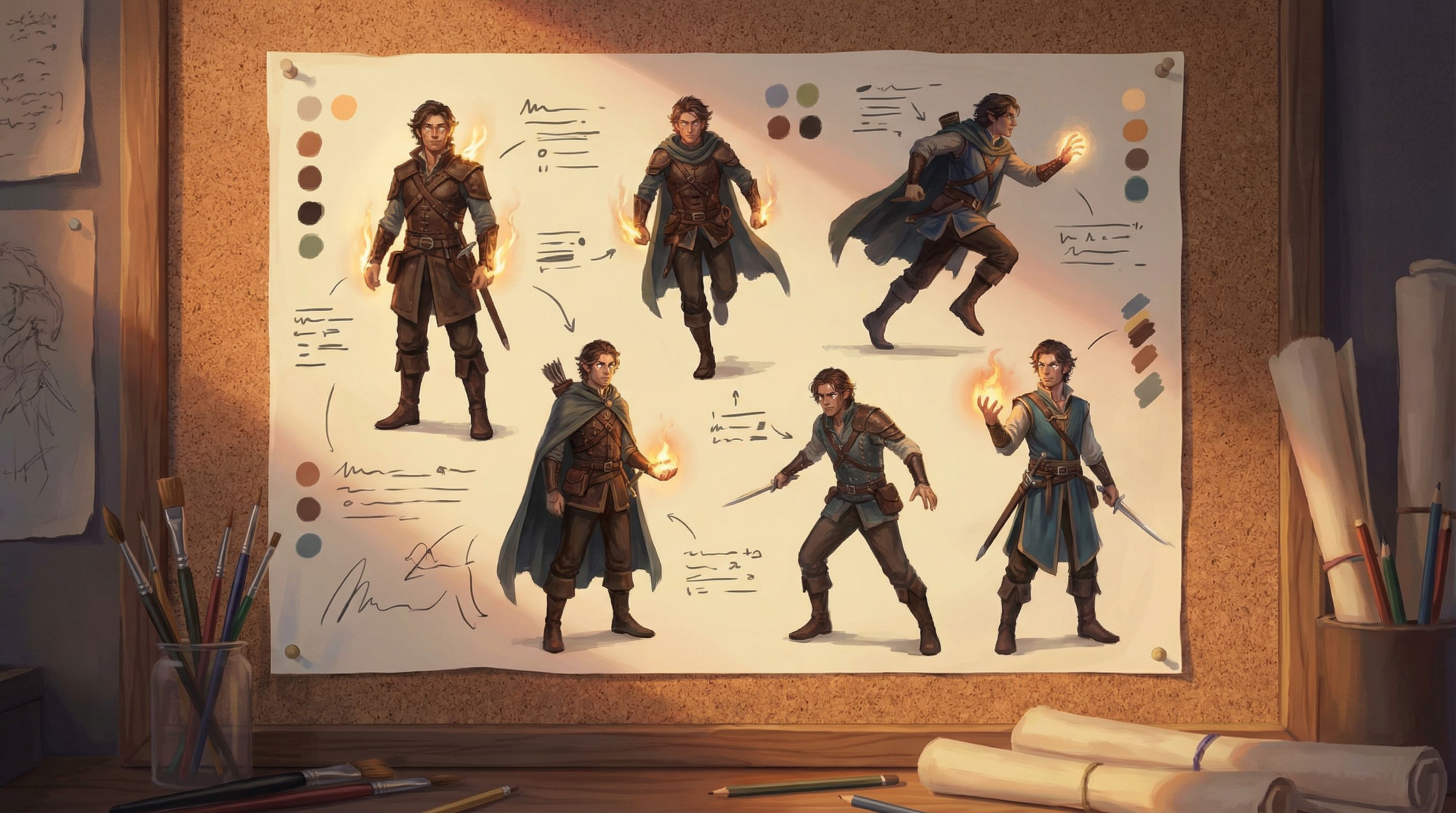
Create a mini‑guide for each major character
For every recurring character, define:
- Silhouette: tall/short, broad/slender, distinctive outline.
- Signature colors: 1–2 colors that show up in outfits or props.
- Key features: hair style, face shape, scars, tattoos, assistive devices.
- Default outfit + variations: casual, formal, battle gear, work uniform.
Write prompts that lock these in:
“young Black woman engineer, short coily hair, round glasses, oil‑stained overalls with teal patches, sturdy boots, confident posture, soft painterly illustration, warm workshop lighting”
Keep these in a shared doc or inside your Questas project notes so you can quickly copy‑paste and adapt.
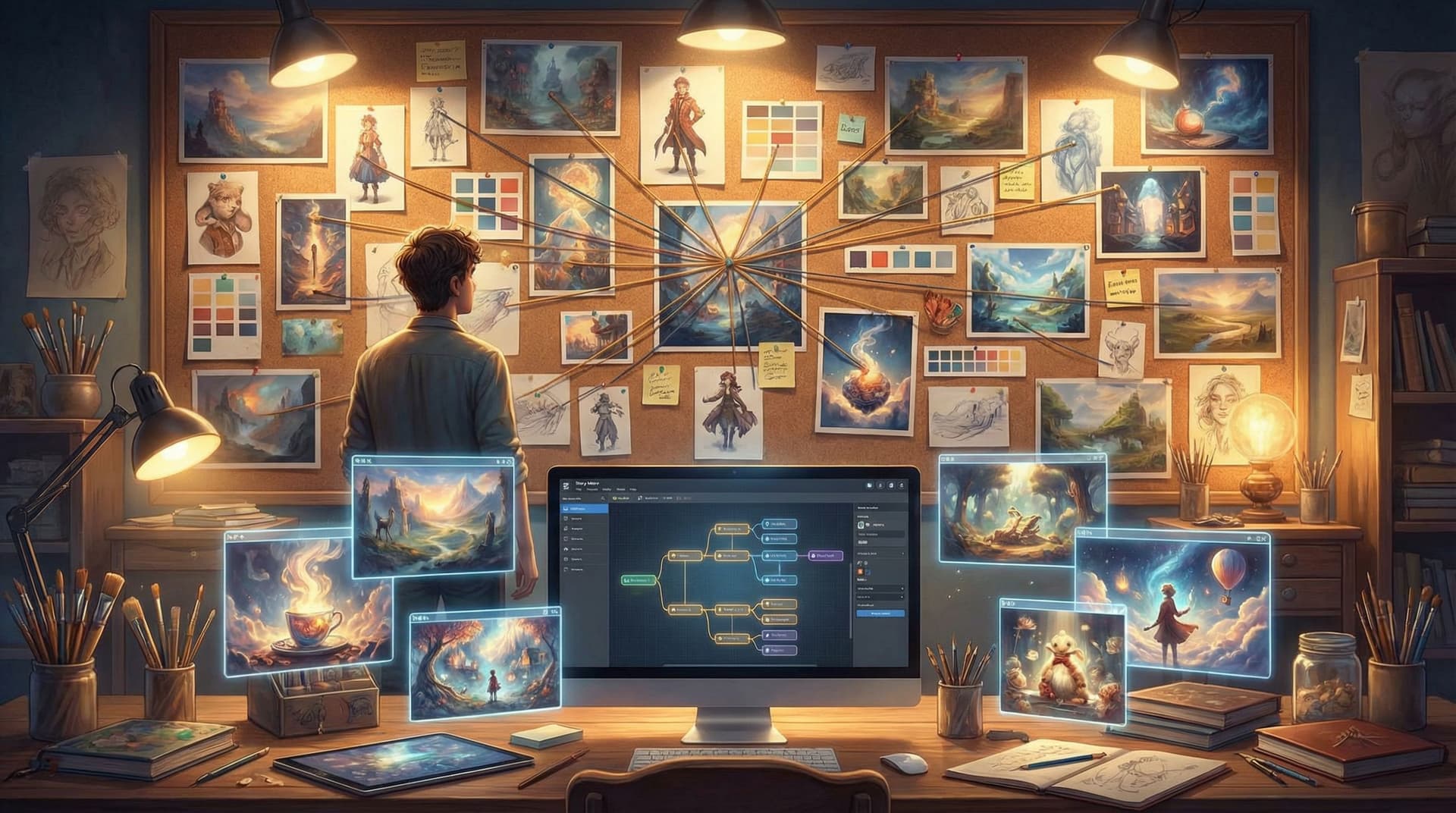
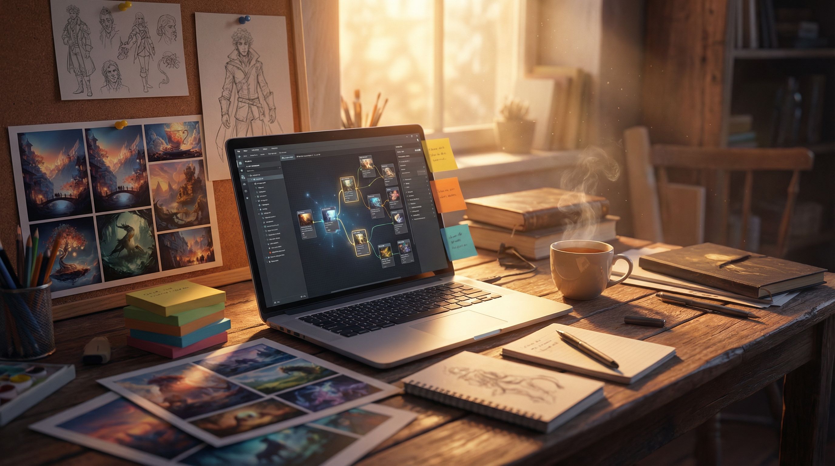
Generate a reference sheet in Questas
Use your character prompts to create:
- Front, 3/4, and profile views in your chosen style.
- A few emotional expressions (worried, delighted, determined).
- One group shot with several characters together.
Drop these into a “Style Guide” scene or separate reference project in Questas. When you generate new scenes, compare them against these references and adjust prompts until the match feels strong.
Step 4: Define Location & Environment Templates
Locations are the stage your choices play out on. Treat them like recurring characters.
For each key location, capture:
- Overall concept: one sentence that nails the feel.
- Architectural style: materials, shapes, era influences.
- Color & light: how this place usually looks at rest.
- Weather / atmosphere: foggy, dusty, crisp, humid, etc.
Example:
“The rooftop garden: a patchwork of mismatched planters and solar panels, with cables strung between small wind turbines. Late afternoon sun, long shadows, warm gold and deep teal palette, distant city skyline hazy with smog.”
Then define variants tied to story states:
- Rooftop garden before the heist (peaceful, tidy).
- Rooftop garden during the heist (chaotic, motion blur, dynamic lighting).
- Rooftop garden after the storm (damaged, debris, darker sky).
This makes it easy to keep visual continuity while reflecting consequences.
Step 5: Translate the Guide into Reusable Prompt Blocks
Your style guide is only as useful as it is usable. The trick is turning it into prompt building blocks you can mix and match.
Create a prompt library
Organize a simple text doc or note with sections like:
- Global style: your rendering, color, and lighting defaults.
- Characters: one block per recurring character.
- Locations: one block per key environment.
- Camera & composition: phrases for angles and framing.
Example structure:
-
Global style block
soft painterly illustration, slightly desaturated colors, warm cinematic lighting, subtle film grain -
MC block
young Black woman engineer, short coily hair, round glasses, teal‑patched overalls, sturdy boots, confident posture -
Rooftop garden block
patchwork rooftop garden with solar panels and wind turbines, mismatched planters, hazy city skyline
When you generate a new scene in Questas, you’re not inventing from scratch. You’re combining blocks:
MC + rooftop garden + global style + “sunset, medium‑wide shot, camera at eye level, main character on left third looking over city”
Over time, this library becomes a powerful accelerator for bigger projects or a full pipeline, especially when paired with the workflows in our guide to drafting, testing, and publishing at scale.
Step 6: Version, Test, and Refine Your Guide
Your first style guide is a hypothesis. You’ll only know how well it works once you start building.
Run small style tests
Before committing to a full adventure, create:
- 3–5 test scenes showing different locations.
- A short sequence (3–4 scenes) with the same character.
- One alternate branch that revisits a location under different conditions.
Ask:
- Does the character feel like the same person across scenes?
- Does the world feel cohesive even when the plot diverges?
- Are there prompts that consistently break the style and need revising?
Get outside eyes
Share your tests with a friend, collaborator, or small player group. Don’t ask, “Do you like it?” Ask:
- “Can you tell which scenes belong to the same place?”
- “Do any characters feel like different people between scenes?”
- “If you had to describe the style in three words, what would they be?”
If their three words don’t line up with your mission statement, tweak your guide and prompts.
Keep the guide alive
As you build more adventures in Questas, you’ll discover new tricks:
- Phrases that reliably produce your desired look.
- Phrases that seem good but cause drift.
- Edge cases (e.g., night scenes, flashbacks) that need special rules.
Update your style guide regularly. Think of it as a living document, not a sacred tablet.
Step 7: Make the Guide Collaborative‑Friendly
If you’re co‑creating stories with a team, classroom, or community, a shared visual style guide is essential. It keeps everyone rowing in the same direction, even when multiple people are generating images.
To make your guide team‑ready:
- Centralize it. Store it in a shared doc, wiki, or a dedicated “Style” scene inside your Questas project.
- Show examples. For each rule, include 1–2 “on‑style” images and, if helpful, 1 “off‑style” example with notes.
- Define roles. Who can change the guide? Who reviews new visuals for consistency?
- Keep it short. Aim for a 2–4 page guide that’s actually read, not a 40‑page tome nobody opens.
If you’re looking to go deeper on working with others, our post on collaborative Questas adventures has practical structures you can plug this guide into.
Bringing It All Together
Let’s recap the journey from moodboard to mission:
- Curate a focused moodboard that truly represents how you want your entire adventure to feel.
- Write a visual mission statement that captures genre, tone, and representation.
- Define concrete rules for aspect ratio, color, rendering style, camera behavior, and ethics.
- Build character and location mini‑guides so recurring elements stay recognizable.
- Turn your guide into prompt blocks you can reuse inside Questas instead of reinventing the wheel.
- Test, gather feedback, and refine the guide as you generate scenes and branches.
- Make it collaborative‑ready so teams and communities can build within the same visual universe.
The result isn’t just prettier images. It’s a story world that feels intentional, trustworthy, and rich—no matter which path your players take.
Your Next Step: Turn Inspiration into a Playable Look
You don’t need a massive production to start. Here’s a simple way to put this into practice today:
- Pick one story idea you’d love to build in Questas.
- Create a 12–20 image moodboard that fits only that idea.
- Write a one‑paragraph visual mission statement.
- Draft a one‑page style guide covering:
- Aspect ratio & framing
- Color & lighting
- Rendering style
- One main character
- One key location
- Open Questas, start a new project, and build 3–5 test scenes using your guide.
By the time you’ve done that, you won’t just have a moodboard—you’ll have the beginnings of a visual language your players can actually step into.
Adventure awaits. Your world already looks incredible in your head. It’s time to give it a consistent face your players will never forget.