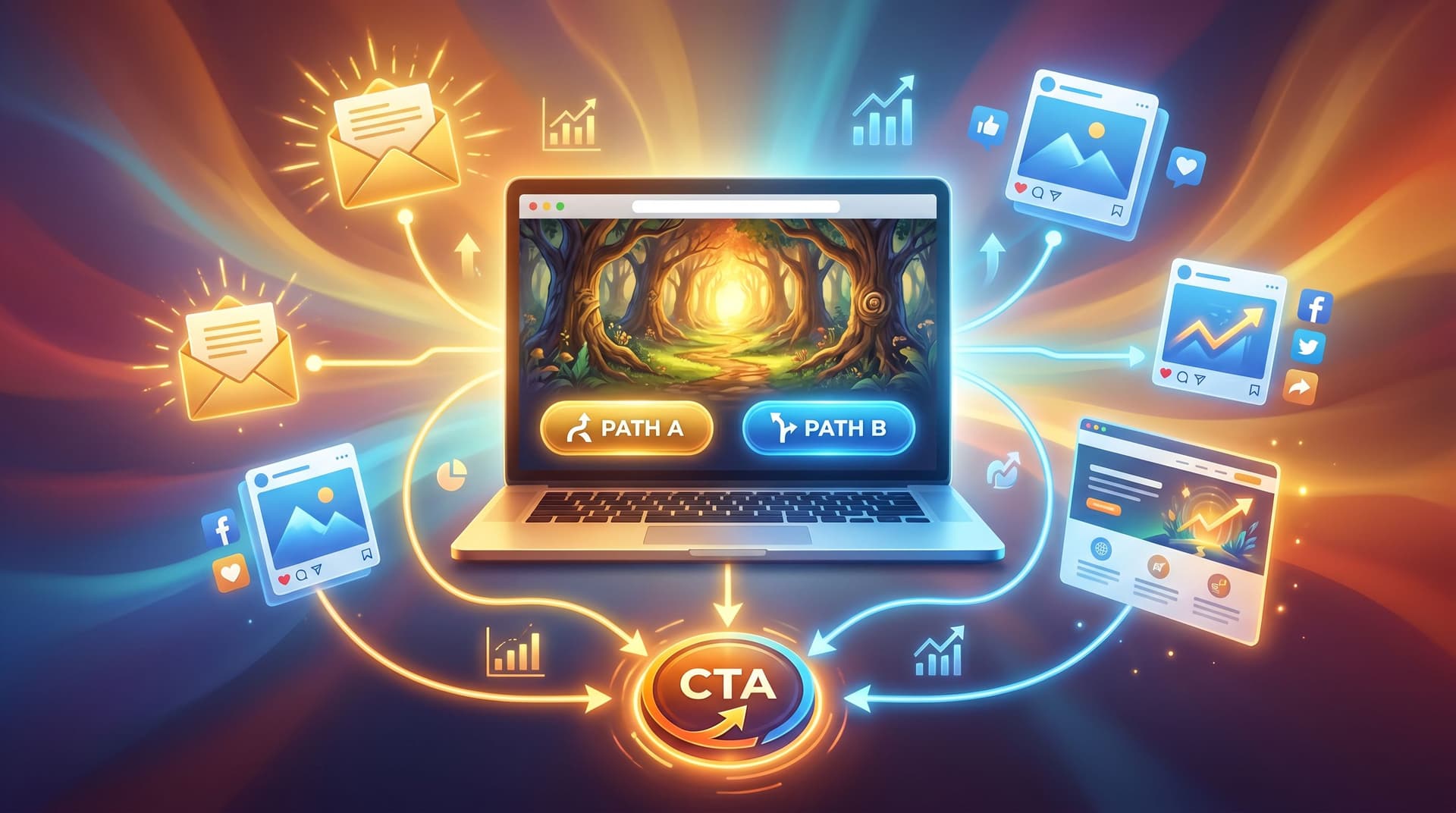
Minimal Choices, Max Impact: Designing Single-Decision Questas for Email, Social, and Landing Pages

Most people think “interactive story” and picture a dense web of branches, dozens of choices, and a sprawling map of possibilities.
That’s great for deep experiences. But for channels like email, social posts, and landing pages, that much complexity can actually hurt performance.
Here’s the quiet truth: one well-designed decision can outperform a dozen shallow ones.
Single-decision quests—tiny, focused interactive moments—are perfect for:
- Email campaigns where you want one clear click
- Social posts that invite a quick but meaningful interaction
- Landing pages that turn idle curiosity into committed action
On a platform like Questas, you can build these micro-experiences visually, no code required: one scene, one pivotal choice, one set of tailored outcomes with AI‑generated images or video.
This post walks through why single-decision Questas work so well, how to design them for different channels, and practical patterns you can reuse.
Why fewer choices often win
Marketers and educators have known for years that too many options kill action.
- Email studies consistently show that messages with a single primary CTA can dramatically outperform emails with multiple competing buttons, with some experiments reporting several‑fold improvements in conversions when the focus is narrowed to one main action.
- Interactive content platforms report significant lifts in total clicks when emails include a simple interactive element like a poll or micro-quiz—as much as a double‑digit percentage uplift in some campaigns—because interaction nudges people from passive scanning into active participation.
- Case studies from interactive quizzes and guided flows on websites show double‑digit conversion lifts with just one or two key decisions that personalize the next step, rather than long, exhausting questionnaires.
Single-decision Questas ride the same psychological currents:
- They reduce cognitive load. One choice feels safe and doable, especially on mobile.
- They sharpen your story. If you only get one fork in the road, you make it count.
- They clarify your funnel. Each choice maps to a clear segment, intent, or next step.
- They’re fast to build and iterate. You can ship, test, and refine in days, not weeks.
If you’ve read our piece on keeping your branch maps sane—“Branch Smart, Not Wide: Blueprint Patterns for Scalable Questas Stories”—single-decision quests are that philosophy turned up to eleven.
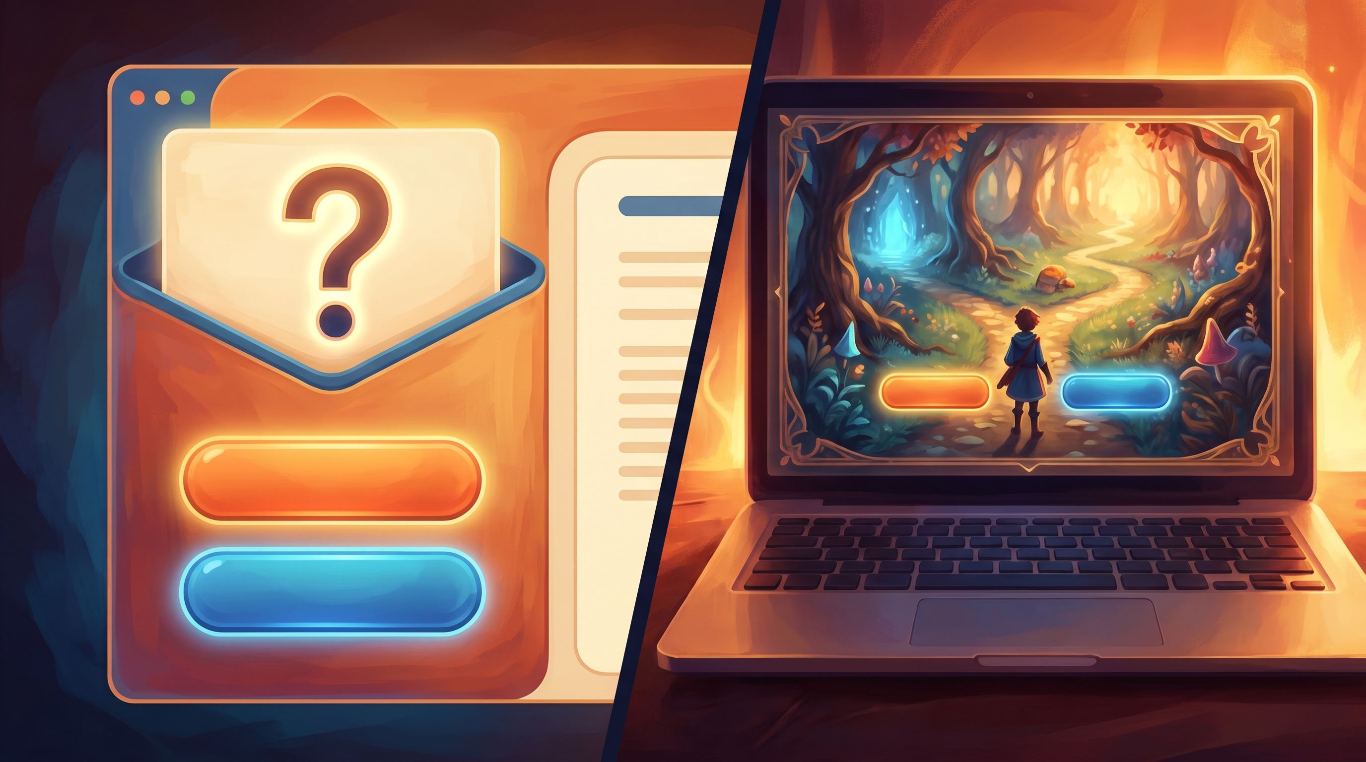
What is a single-decision Questas experience?
On Questas, a single-decision experience is usually:
-
A short setup scene
A tight bit of context: an image, a few lines of copy, maybe a quick video. -
One moment of choice
Typically 2–3 options. Each option is:- Clearly labeled
- Emotionally distinct
- Mapped to a different outcome or next step
-
A tailored payoff
Each choice leads to:- A short resolution scene (what happened)
- A channel-appropriate CTA (what to do next)
From the player’s perspective, it feels like:
“I read a tiny story, made one decision, saw what it meant, and got a next step that actually fits me.”
From your perspective, it’s a segmented, high-intent click you can track and build on.
Where single-decision Questas shine
Let’s look at how these micro-quests plug into three key channels.
1. Email: from “click here” to “step into the story”
Email click‑through rates for many industries hover in the low single digits. Getting someone to click anything is hard. Getting them to click the right thing is harder.
A single-decision Questas scene embedded or linked from an email can act like a mini interactive poll with narrative stakes.
Example:
You’re a B2B SaaS team sending a nurture email about onboarding challenges.
Instead of three separate links to three guides, you send:
“You’re about to launch a new onboarding flow. What matters most right now?”
- Reduce support tickets
- Improve trial-to-paid conversion
- Make onboarding feel less overwhelming
Each option is a button that opens a short Questas scene:
- A visual of a product manager at their desk
- A 30–60 second interaction that dramatizes their chosen priority
- A tailored CTA, like “See the onboarding playbook for cutting support tickets.”
Why this works in email:
- The choice itself is the hook—it’s more compelling than a generic “Read the guide.”
- Each click is self-segmentation: you now know what that subscriber cares about.
- The story scene creates an emotional bridge to your resource or offer, not just a cold redirect.
You can build similar single-decision experiences for:
- Product recommendation emails (“Which best describes your team?”)
- Event follow-ups (“How did the session land for you?”)
- Newsletter features (“What would you do in this situation?”)
2. Social: turn scrolls into small adventures
On social platforms, you get seconds of attention at best. A long, complex interactive story is too heavy—but a single decision framed as a story prompt is perfect.
Think of your social post as:
- A hook line (“You’ve got one shot to impress a new client—what do you do?”)
- An eye‑catching visual pulled from your Questas scene
- A single link or CTA (“Tap to play your 30‑second scenario.”)
Inside the quest:
- One setup scene that matches the post image
- One meaningful choice (2–3 options)
- One quick resolution + CTA (follow, subscribe, download, or join)
Use cases:
- Thought leadership: Turn a hot take into a “what would you do?” scenario. For deeper inspiration, see how we use branching essays in “Branching Narratives for Thought Leadership: Turning Your POV into Playable Questas Essays”.
- Fandom & community: Let fans pick a canon‑bending choice (“Save the mentor or the city?”) and then invite them to share which route they chose.
- Education & training: A single ethical dilemma or safety decision that leads to a short explanation and a link to a longer course.
Because the quest is short, people are more willing to click from social, play through, and share.
3. Landing pages: one choice, one clearer path
Landing pages often suffer from either:
- Too many options (menus, multiple CTAs, competing offers), or
- Too little agency (one big button, no sense of personalization).
A single-decision quest embedded above the fold can solve both.
Example:
You’re driving traffic to a product page for a complex tool. Instead of jumping straight into features, you open with:
“What kind of team are you?”
- Early‑stage startup
- Growing mid‑market team
- Enterprise with multiple departments
Each option:
- Plays a tiny story beat that mirrors their context
- Reframes your product benefits in their language
- Routes them to the most relevant section of the page or a tailored sub‑page
This taps into the same conversion principles that make narrative product pages so effective: cognitive sequencing, progressive disclosure, and choice architecture. You’re letting visitors feel in control while quietly guiding them toward the best path.
You can also use single-decision quests on:
- Webinar registration pages (“What do you most want from this session?”)
- Lead magnets (“Pick your level: beginner, intermediate, advanced.”)
- Pricing pages (“What matters most: flexibility, support, or price?”)
Designing a high-impact single decision
If you only get one choice, it has to carry real weight. Here’s how to design it.
1. Start with the question, not the feature
Ask: “What do I genuinely want to learn about this person, and what do they genuinely want to express?”
Good single-decision questions often:
- Expose a value or priority (“Speed vs. thoroughness”)
- Reveal a stage or segment (“Just exploring vs. ready to buy”)
- Surface a self-image (“I’m the cautious planner” vs. “I’m the bold experimenter”)
Avoid questions that are:
- Purely demographic (“What’s your company size?”) unless you can dramatize them
- Obviously self‑serving (“Are you ready to book a demo right now?” with no nuance)
2. Make options emotionally distinct
Each choice should feel like a different kind of person or different philosophy, not just a slight wording change.
Instead of:
- “Learn more about product A”
- “Learn more about product B”
Try:
- “I want a simple, done‑for‑you setup.”
- “I want full control, even if it’s more complex.”
In Questas, label each choice clearly and use AI‑generated visuals to reinforce the vibe of each option—color, character posture, environment.
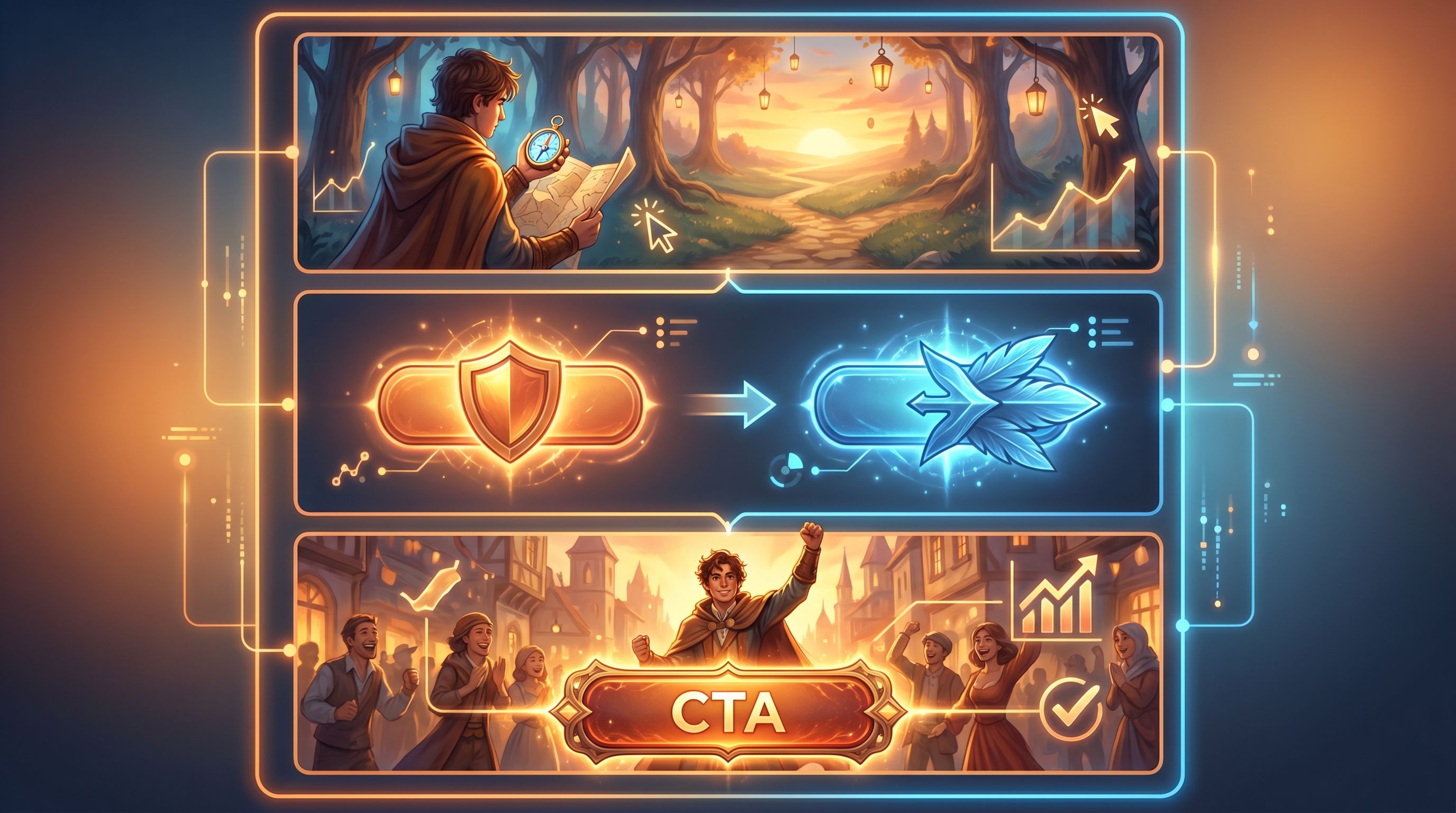
3. Align every outcome with a clear next step
Each branch in your single-decision quest should end with:
- A short narrative payoff (what happened or what this says about them)
- A CTA that logically follows from that payoff
For example:
-
Choice: “I prioritize long‑term trust over quick wins.”
- Payoff: A scene where the character turns down a sketchy but lucrative deal.
- CTA: “Explore our case study on building trust‑first partnerships.”
-
Choice: “I’ll take the quick win if the risk is reasonable.”
- Payoff: A scene where the character experiments, learns fast.
- CTA: “See how teams like yours run rapid experiments with our toolkit.”
If the CTA feels bolted on, revisit the question. The best single-decision quests feel like the CTA is simply the next page of the story.
4. Keep the experience under 90 seconds
This is crucial for email, social, and landing pages.
Aim for:
- 1 short intro scene (40–80 words)
- 1 choice moment (2–3 options)
- 1 resolution scene (40–80 words) + CTA
Readers should feel: “That was quick, fun, and actually helpful,” not “I just got pulled into a whole game when I just wanted to skim an email.”
If you love designing deeper structures, save them for dedicated experiences—and check out “From Branch Map to Beat Sheet: Structuring Scene Pacing in Complex Questas Stories” for that level of build.
Building a single-decision quest in Questas, step by step
Here’s a practical workflow you can follow inside Questas.
Step 1: Define the channel and goal
Pick one:
- Email: Increase click‑through and segment by interest
- Social: Drive traffic and spark conversation
- Landing page: Improve conversion and route visitors to the right path
Write a one‑sentence goal:
“Use a single decision to segment subscribers by X and send them to Y.”
Step 2: Draft the core question and options
In a doc or notes app, write:
- The question in player‑facing language
- 2–3 options, each mapping to a distinct segment or mindset
Stress‑test it:
- Would a real person hesitate for a moment, thinking about what fits them?
- Would you be able to send each option to a different follow‑up without it feeling random?
Step 3: Sketch the scenes in Questas
In the Questas visual editor:
- Create the intro scene node.
- Keep text tight.
- Add a strong AI‑generated image or looped video to set mood.
- Add a decision node with your 2–3 options.
- Label buttons clearly.
- Consider subtle visual differences for each option.
- For each option, create a resolution scene node.
- Show a brief consequence or reflection.
- Add a CTA button that links to your email resource, social destination, or landing page section.
If this is your first time, our guide “From Idea to Interactive: A Step‑By‑Step Workflow for Building Your First Questas Story” walks through the basics in more depth.
Step 4: Tailor for the channel
-
Email:
- Use a static thumbnail or GIF of the intro scene as the email image.
- Make the image and a nearby button both link into your Questas experience.
- Keep surrounding copy minimal so the story invitation stands out.
-
Social:
- Crop a striking frame from the intro scene.
- Write a hook that mirrors the question in plain language.
- Use a short, trackable link in the post.
-
Landing page:
- Embed the quest above the fold or in a prominent section.
- Add a short line of copy explaining what the visitor gets by interacting.
Step 5: Measure and iterate
Single-decision quests are perfect for quick experimentation.
Track:
- Entry rate: How many people who see the invitation actually start the quest?
- Choice distribution: Which options are chosen most often? Does it match your assumptions?
- Downstream conversions: Do certain choices correlate with higher demo requests, purchases, or course completions?
Then iterate on:
- The framing of the question (more concrete, more emotional, or more specific)
- The visuals (does the art make the stakes clear?)
- The CTA wording and destination
Because Questas is visual and no‑code, these tweaks are fast—no dev cycles required.
Common pitfalls (and how to dodge them)
Even small quests can go sideways. Watch out for:
-
Cosmetic choices
If all options lead to the same generic outcome, players feel tricked. Make sure each choice changes something meaningful: framing, recommendation, or next step. -
Overlong intros
You’re not writing a novel. If your intro scene scrolls more than a screen, cut ruthlessly. -
Mismatched promises
If the email or social post sells a tense dilemma and the quest feels trivial, trust drops. Align tone and stakes. -
CTAs that break the spell
A jarring “BUY NOW” after a nuanced scenario feels off. Keep language and visuals consistent with the story. -
Too many options
Two or three is plenty. Four or more starts to feel like a survey, not a story.
Bringing it all together
Single-decision Questas are the micro‑dose version of interactive storytelling:
- Just enough narrative to matter
- Just enough choice to feel seen
- Just enough structure to route people to the right next step
For channels where attention is scarce—email, social, landing pages—that’s exactly what you need.
By:
- Asking one sharp, revealing question
- Offering 2–3 emotionally distinct options
- Paying off each choice with a tailored outcome and CTA
- Keeping the whole experience under 90 seconds
…you can turn passive readers into participants, and casual visitors into qualified, self‑segmented leads.
Your next move
You don’t need a giant branching saga to start.
- Pick one upcoming email, social post, or landing page.
- Write a single, meaningful question you’d love your audience to answer.
- Open Questas and build a three‑scene micro‑quest around it.
Ship it, watch how people choose, and let those choices guide what you create next.
Adventure doesn’t always require a maze of paths. Sometimes, one good decision is all it takes to change the journey—for you and your audience.