The First Five Screens: Onboarding New Players Smoothly into Complex Questas Worlds

Complex, branching storyworlds are thrilling to design—and intimidating to enter.
If your quest opens with dense exposition, a wall of choices, or a confusing UI, many players will quietly bounce before they ever see the good stuff. The first five screens act like a customs checkpoint for your world: they decide who gets through, how prepared they are, and whether they’re excited or overwhelmed.
This post is about treating those first moments as a deliberate onboarding sequence rather than a throwaway intro. We’ll focus on how to design those screens in Questas so that new players feel guided, curious, and ready to dive into even the most intricate branching narratives.
Why the First Five Screens Matter So Much
You don’t get a second chance at a first impression—especially in interactive stories.
A few reasons those early screens are disproportionately important:
- Attention is fragile. People decide in seconds whether something feels approachable or like “homework.”
- Cognitive load spikes early. New world, new UI, new rules, new stakes—all at once. If you don’t manage that load, players shut down.
- Early friction gets misattributed. If players feel confused on Screen 2, they rarely think, “Ah, this is a pacing issue.” They think, “This isn’t for me.”
- Expectations crystallize fast. Your first choices and visuals silently tell players what kind of experience they’re in for: power fantasy or quiet reflection, sandbox or guided story, training or entertainment.
When you design those first five screens with intention inside Questas, you:
- Increase completion rates for complex quests.
- Reduce “I’m lost” feedback from testers and stakeholders.
- Make it far easier to introduce advanced systems later (timers, resources, multi-POV, etc.).
If you’re already thinking about large story graphs and pacing, you might enjoy pairing this with From Branch Map to Beat Sheet: Structuring Scene Pacing in Complex Questas Stories, which zooms out to the whole experience. Here, we’re zooming all the way in to the opening.
The Five-Screen Framework (and What Each Screen Should Do)
Think of your first five screens as a mini-arc with a job to do at each step.
A simple, robust pattern:
- Screen 1 – The Promise
Hook, tone, and a single clear action. - Screen 2 – The Situation
Who you are, where you are, and what’s immediately at stake. - Screen 3 – The First Safe Choice
A low-risk decision that teaches how choices work. - Screen 4 – The First Consequence
Show that choices matter—without punishing. - Screen 5 – The On-Ramp
Transition into the “real” quest structure with clarity and momentum.
Let’s unpack what each of these looks like in Questas, and how you can build them without overwhelming new players.
Screen 1: Make a Clear, Playable Promise
Your very first screen should answer one question in the player’s mind:
“Why should I care enough to tap Next?”
Instead of opening with lore or instructions, aim for a sharp, concrete promise:
- Genre + role + tension in one or two lines.
- A strong, on-theme visual.
- Exactly one obvious action.
Examples of strong opening lines:
- “You wake up alone in the orbital monastery. The last thing you remember is selling your favorite memory.”
- “You’re the newest sales rep in a team that hasn’t hit quota in three quarters. Your manager has one question: ‘How do you handle a shaky lead?’”
- “You’re the only engineer on call when the alarms start. The dashboard says ‘minor incident.’ Your gut says otherwise.”
In Questas:
- Use a single, full-bleed AI-generated image or video that conveys mood and genre.
- Keep text concise—aim for 1–3 short paragraphs.
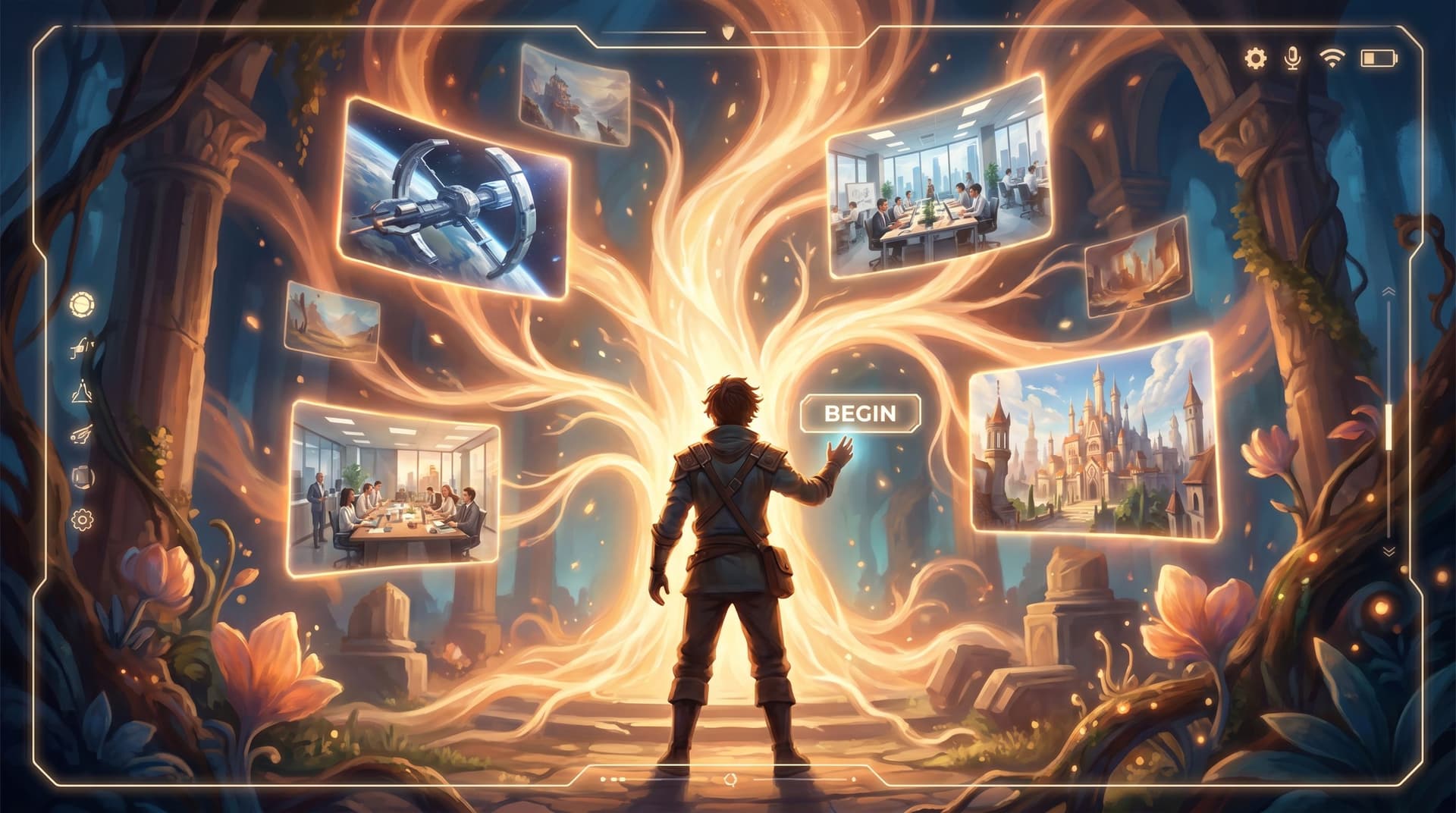
- Include one primary button (e.g., “Begin”, “Enter the station”, “Step into the briefing”) instead of multiple choices.
This isn’t the moment for branching yet. It’s the moment to say: Here’s the kind of story you’re in, and here’s your doorway in.
Screen 2: Ground the Player in a Simple Situation
Once they’ve stepped through the doorway, your job is orientation, not exposition.
By the end of Screen 2, players should know:
- Who they are (role, not full biography).
- Where they are (immediate environment, not full map).
- What’s pressing right now (one short-term tension or goal).
Do this well by:
- Writing in second person (“You…”) to anchor identity.
- Focusing on sensory details that hint at the larger world without explaining it.
- Highlighting one immediate problem: a ringing phone, an incoming ship, a nervous client, a countdown.
You can add a small UI hint here if needed: a short line like, “You’ll make choices that shape what happens next.” But keep instructional text lightweight and integrated into the fiction.
If your quest is based on nonfiction content—like a policy paper or whitepaper—you can still start with a grounded scenario. For more on that style of opening, see The Nonfiction Quest: Turning Reports, Whitepapers, and Think Pieces into Decision-Driven Questas.
Questas-specific tips for Screen 2:
- Use a consistent visual style that you’ll carry forward. If you’re planning a series, you might also draw on ideas from AI as Art Director: Building Cohesive, On-Brand Visual Languages for Your Questas Series.
- Keep the layout uncluttered: one main image, one text block, one button.
- Avoid introducing variables, timers, or complex UI elements yet.
Your goal: the player should feel like they’ve “arrived” somewhere specific, with a clear sense of “what’s happening right now.”
Screen 3: Teach Choice with a Low-Stakes Decision
This is where you introduce branching—but gently.
The first choice should:
- Be easy to understand without prior knowledge.
- Feel low-risk in terms of story stakes.
- Demonstrate how the UI works (tapping options, maybe seeing a brief tooltip or hover state).
Examples:
-
“How do you respond to the incoming call?”
- Answer immediately.
- Let it ring once while you scan the room.
- Send a quick text: “Call you back in 2?”
-
“You’re late to your first team standup. What do you do?”
- Rush in without coffee.
- Grab coffee and accept you’ll be 2 minutes late.
- Message the team that you’re stuck with a client.
These aren’t life-or-death yet. They’re identity-shaping and tone-setting—great candidates for the “quiet choices” that build empathy rather than drama.
In Questas:
- Use 2–3 options; avoid more than 4 on the first decision.
- Keep choices short and specific, written as what the player does or says.
- Consider subtle microcopy below the choices like, “Your decisions will shape how people respond to you.”
Remember: the point of Screen 3 is not to test the player. It’s to reward them with a feeling of agency.
Screen 4: Show a Visible, Fair Consequence
If Screen 3 is the first step, Screen 4 is the first footprint.
Players need to see that:
- Their choice changed something.
- The change was understandable and fair.
- The story is still very much alive—no dead ends yet.
Good consequence patterns for Screen 4:
- A character reacts differently (warmer, cooler, more suspicious).
- You gain or lose a small resource (a bit of time, a favor, a clue).
- The next problem shifts slightly (you’re better prepared in one way, worse in another).
Avoid harsh punishment here. This isn’t the place for “You chose wrong, game over.” If you’re interested in using failure more deeply later on, check out Designing Failure on Purpose: How to Use ‘Bad’ Endings to Teach, Not Punish, in Questas.
Questas implementation ideas:
- Use conditional text or variables behind the scenes, but keep the presentation simple: a few lines of reaction, maybe a subtle icon change.
- Consider a small visual change: the same location from a slightly different angle, or a character’s body language shifting.
- Keep the node short; this is a beat, not a lecture.
By the end of Screen 4, players should be thinking, “Okay, my choices matter—and I kind of see how.”

Screen 5: Merge Onto the Main Highway
Now that players are oriented, have made a choice, and seen a consequence, Screen 5 is your on-ramp to the full quest structure.
This screen should:
- Clarify the short-term objective (the next 5–10 minutes of play).
- Hint at the larger arc without overexplaining.
- Introduce any recurring UI elements you’ll rely on (e.g., inventory, relationship meters, timers) in a minimal way.
Example goals Screen 5 might establish:
- “Survive your first shift on the station without triggering an incident report.”
- “Navigate your first week on the sales team and close one meaningful deal.”
- “Guide the leadership team through this crisis meeting without losing their trust.”
You might:
- Show a simple progress indicator (e.g., “Shift: 1 of 3” or “Client 1 of 4”).
- Introduce a single variable visually (e.g., a trust bar or time remaining), but avoid dumping all your systems here.
From this point forward, you’re in the main rhythm of your quest. The job of the first five screens is essentially done.
Practical Patterns for Complex Worlds
If your quest is especially intricate—multi-POV, timelines, resource systems—onboarding well becomes even more important. Here are some patterns that play nicely with Questas.
1. The “Cold Open, Then Briefing” Pattern
- Screens 1–2: Drop players into a tense moment with minimal context.
- Screens 3–4: Let them make a small decision and see a consequence.
- Screen 5: Cut to a short “briefing” or debrief where a character or narrator frames what just happened and what’s coming next.
This pattern gives you both immediacy and clarity: players feel the stakes before they get the explanation.
2. The “Guided Tour in Disguise” Pattern
Instead of a dry tutorial, embed your onboarding in the fiction:
- A mentor character walks you through the space.
- An AI assistant overlays small hints.
- A colleague messages you with “Here’s how we do things around here.”
Each of the first five screens introduces one mechanic in character—choices, consequences, maybe a simple resource—without ever breaking immersion.
3. The “Micro-Pilot” Pattern
Borrow from the idea of a playable pilot (explored in From Premise to Playable Pilot: Rapidly Testing New Story Worlds in Questas Before You Commit):
- Treat the first five screens as a self-contained micro-scenario inside your larger quest.
- Give it a clear beginning, middle, and end—a tiny arc.
- After Screen 5, you can time-skip, shift POV, or zoom out to the broader world.
This is especially powerful when you’re testing new storyworlds or training scenarios: you can iterate quickly on this micro-onboarding loop before building out the rest.
Common Onboarding Mistakes (and How to Fix Them)
Even experienced creators fall into a few traps with those first screens. Watch out for:
-
Lore Dump Syndrome
- Symptom: Three paragraphs of backstory before anything happens.
- Fix: Move 80% of that info into later scenes. Keep only what’s needed for the first decision.
-
Choice Overload
- Symptom: The first decision offers 6+ options, some of which are barely distinguishable.
- Fix: Cut to 2–3 sharply distinct choices. Merge or delay edge cases.
-
Invisible Consequences
- Symptom: Players choose something on Screen 3, but Screen 4 feels identical no matter what.
- Fix: Add at least one line of reactive text or a small visual change. Make the difference legible.
-
System Dump
- Symptom: Timers, inventories, relationship meters, and multiple currencies all appear in the first minute.
- Fix: Introduce systems one at a time across the first few scenes, not all on Screen 1.
-
Unclear Role
- Symptom: Players aren’t sure who they’re playing as or what authority they have.
- Fix: Use a clean role statement early: “You are the newly promoted shift lead on Deck 7.”
If you’re already deep into a build, you don’t need to rebuild your whole quest. You can often insert or rewrite just the first 3–5 nodes in Questas and dramatically improve onboarding.
A Simple Checklist for Your Next Questas Build
When you’re ready to ship—or revise—a quest, run the first five screens through this quick checklist:
Screen 1
- [ ] One clear promise (genre + role + tension).
- [ ] One strong visual, no clutter.
- [ ] One obvious action.
Screen 2
- [ ] Player knows who they are and where they are.
- [ ] One immediate problem is clear.
- [ ] Text is concise; no lore dump.
Screen 3
- [ ] 2–3 clear, low-stakes choices.
- [ ] Options are distinct and written as actions.
- [ ] UI for choosing is obvious.
Screen 4
- [ ] Player sees a visible, fair consequence.
- [ ] At least one line or visual element reacts to their choice.
- [ ] No harsh failure yet.
Screen 5
- [ ] Short-term objective is explicit.
- [ ] Any recurring UI/system is introduced lightly.
- [ ] There’s a clear sense of “now the real quest begins.”
Print this out, keep it next to your desk, and run your next Questas prototype through it.
Wrapping Up: Onboarding as Storycraft, Not Just UX
Those first five screens aren’t just a usability problem. They’re storytelling in concentrated form.
When you:
- Make a sharp promise,
- Ground players fast,
- Give them a safe first decision,
- Show a satisfying consequence,
- And merge them onto the main highway with clarity,
…you’re not only reducing friction. You’re signaling respect for your players’ time, attention, and curiosity.
Complex Questas worlds deserve that kind of doorway. So do the learners, customers, and fans you’re inviting inside.
Your Next Step: Build a Five-Screen Prototype
You don’t need a full epic to start.
- Open Questas.
- Sketch just five nodes using the framework above.
- Add simple AI-generated visuals that match your tone.
- Put it in front of one real player and watch how they move.
From there, you can grow outward—branch by branch—knowing your onboarding is doing its job.
Adventure awaits in those first five screens. Go build the doorway your storyworld deserves.