AI Visual Styles 101: Matching Your Questas Imagery to Genre, Tone, and Audience

Great interactive stories don’t just branch—they look like they belong together.
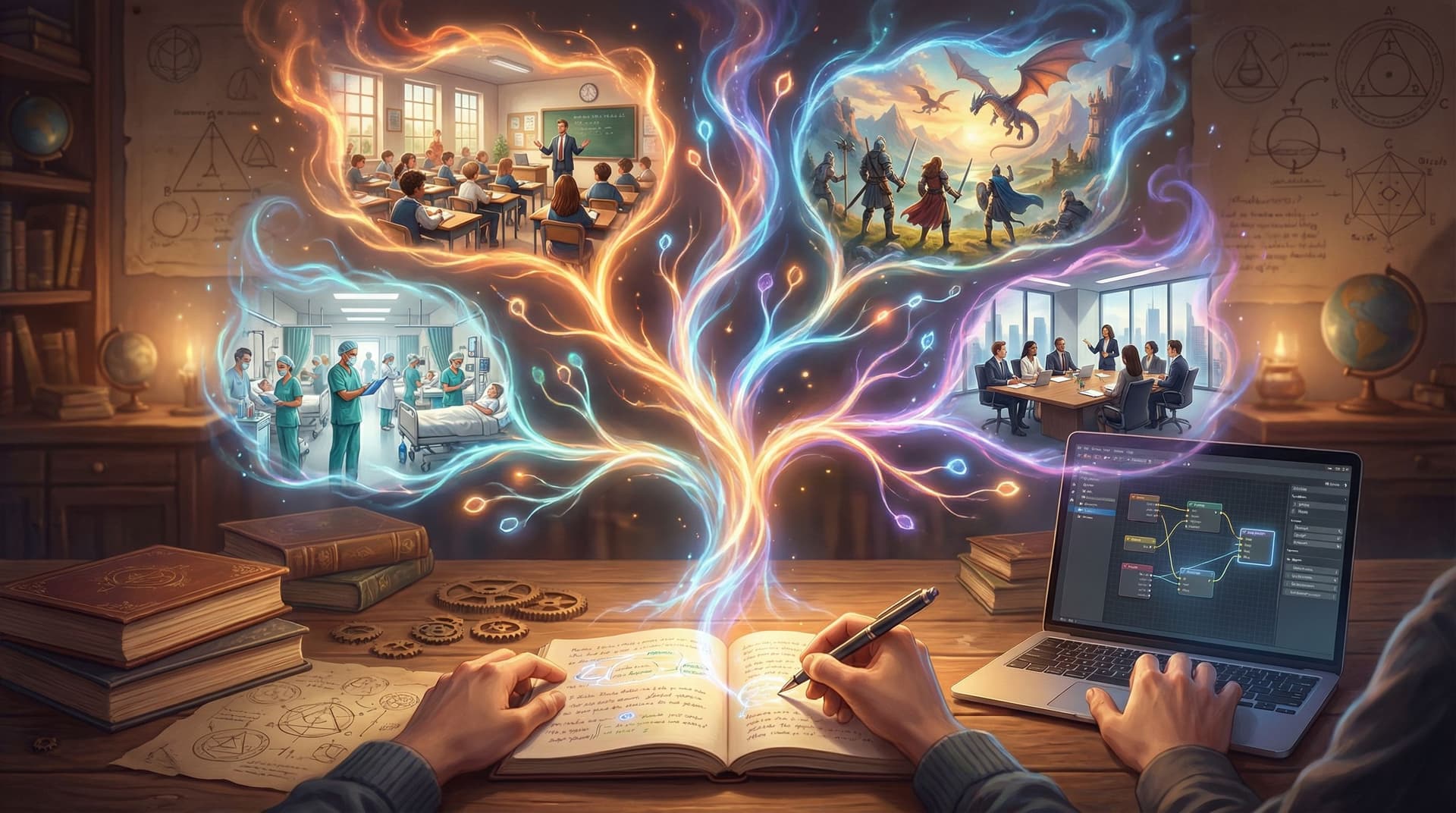
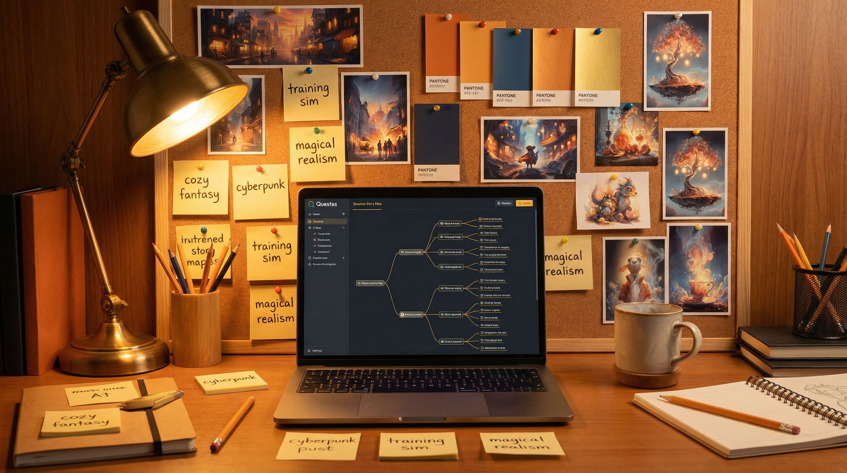
When you’re building a choose‑your‑own‑adventure in Questas, your AI-generated images and videos do a lot of heavy lifting:
- They signal genre before a single line of dialogue.
- They set expectations for tone—silly, solemn, eerie, epic.
- They tell different audiences, “This is (or isn’t) for you.”
Get that visual style wrong, and even a well‑written story can feel confusing or off‑brand. Get it right, and your players feel like they’ve stepped into a coherent world, no matter which branch they take.
This guide walks through how to match your Questas imagery to genre, tone, and audience—so your visuals amplify your story instead of fighting it.
Why Visual Style Matters So Much in Branching Stories
In a linear story, you can sometimes get away with inconsistent visuals. In a branching story, players are constantly jumping between scenes, locations, and timelines. Visual style is the glue that holds that experience together.
Good visual style does three critical jobs:
-
Clarifies what kind of story this is.
A neon cityscape with sharp contrast and lens flares screams cyberpunk. Soft watercolor forests whisper cozy fantasy. Your first few images tell players how to read every choice that follows. -
Reinforces emotional tone.
The same plot beat—"the door creaks open"—feels totally different with:- Harsh, desaturated horror lighting vs.
- Warm, candlelit glow in a children’s fairytale.
-
Guides attention and learning.
In training sims, onboarding flows, and educational branches, visuals are part of the pedagogy. They highlight what matters, make abstract concepts concrete, and help players remember key moments. If you’re building learning-focused experiences, pairing this guide with Beyond Gamification: What Learning Science Can Teach Us About Better Branching Stories will give you a strong foundation.
When your style is intentional, players feel like they’re exploring one coherent universe—even when they’re bouncing between wildly different paths.
Step 1: Define Your Story’s Core Visual Identity
Before you touch a single prompt in Questas, get clear on three anchors:
- Genre – What “shelf” would this live on?
- Tone – How should players feel most of the time?
- Audience – Who are you actually designing for?
Write a one‑sentence style statement that combines all three. For example:
- “A cozy, painterly fantasy for middle‑grade readers, with bright colors and friendly creatures.”
- “A grounded, documentary-style workplace drama for new managers, with realistic offices and diverse teams.”
- “A high‑contrast neon sci‑fi heist for adult players, with cinematic lighting and dynamic camera angles.”
Keep this sentence at the top of your project notes or story bible. If you’re already using the techniques from From Moodboard to Mission: Designing Visual Style Guides for Consistent Questas Adventures, this sentence becomes the headline for your style guide.
Pro tip: Revisit this line any time you’re about to generate a new batch of images. If a prompt or result doesn’t fit the sentence, tweak it.
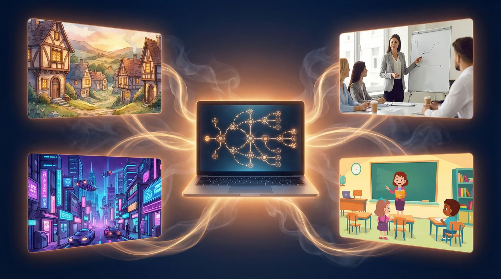
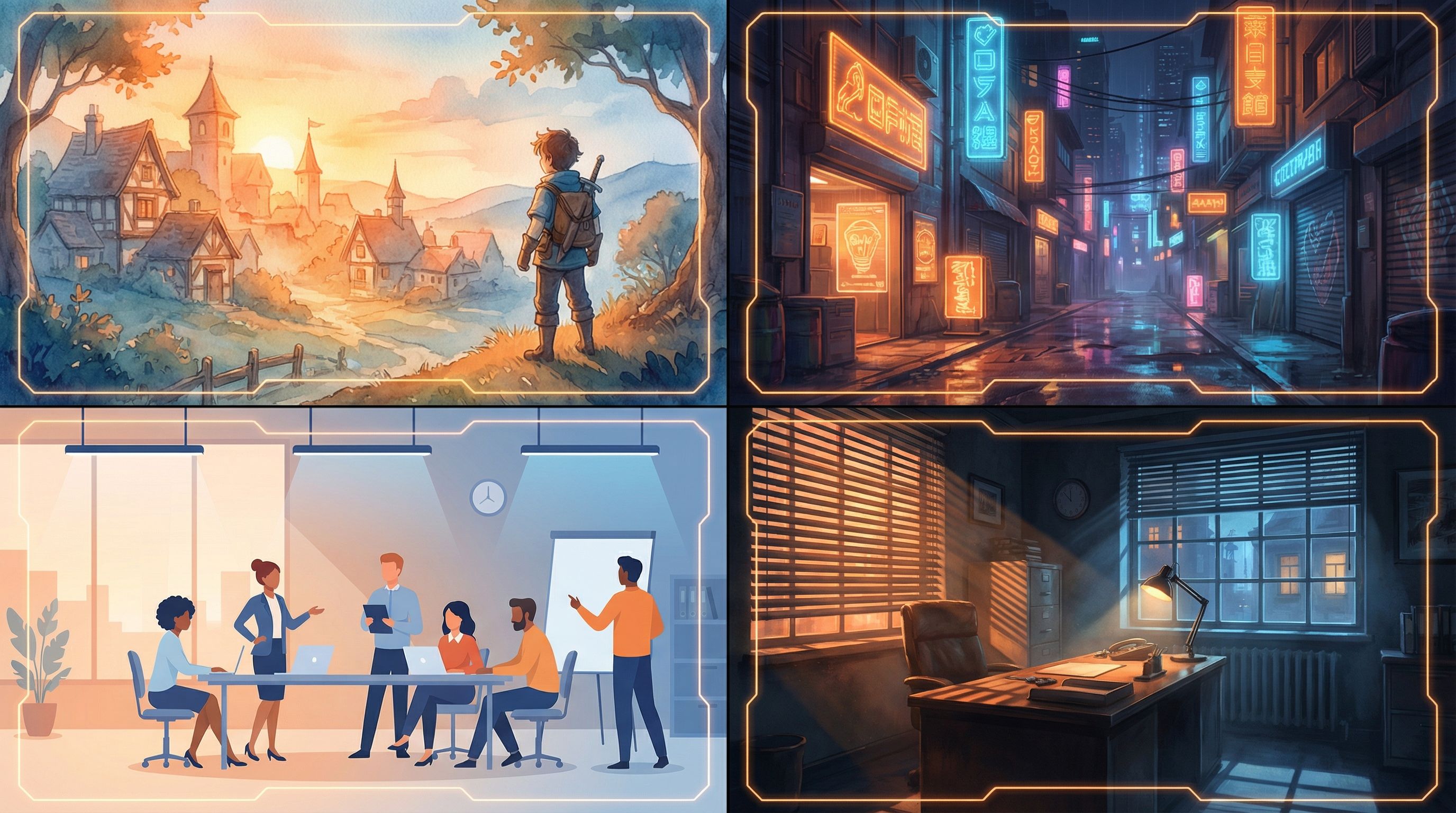
Step 2: Match Visual Style to Genre
Different genres come with strong visual traditions. You don’t have to copy them exactly—but understanding the “defaults” helps you decide when to lean in or subvert them.
Below are some common genres you might build in Questas, with style cues you can bake into your prompts.
Fantasy
Common traits:
- Rich, saturated colors (emerald forests, gold light, deep blues)
- Painterly or illustrated looks
- Ornate costumes, textured environments (stone, wood, cloth)
Prompt ingredients to try:
“painterly, storybook illustration, warm golden light, detailed medieval village, soft brushstrokes, whimsical”
Use this when: You want wonder, discovery, and a sense of myth.
Science Fiction / Cyberpunk
Common traits:
- Neon accents, high contrast, cool palettes (blues, magentas, cyans)
- Futuristic interfaces, holograms, urban density
- Cinematic or photo-real styles
Prompt ingredients to try:
“cinematic, neon-lit city at night, high contrast, rain-soaked streets, shallow depth of field, futuristic technology”
Use this when: Tension, speed, and high stakes are central.
Mystery / Thriller
Common traits:
- Muted or limited color palettes
- Strong shadows, directional light
- Close-ups on faces, hands, or key objects
Prompt ingredients to try:
“moody, film noir lighting, desaturated colors, close-up, subtle expressions, suspenseful atmosphere”
Use this when: You rely on mood, clues, and slow-burn tension.
Comedy / Slice of Life
Common traits:
- Bright, clean colors
- Simple, readable compositions
- Exaggerated expressions or slightly cartoonish proportions
Prompt ingredients to try:
“clean vector style, bright pastel palette, expressive faces, minimal background clutter, playful mood”
Use this when: You want lightness, accessibility, and quick readability.
Horror
Common traits:
- High contrast, deep shadows
- Off-kilter camera angles
- Limited, eerie color palettes (sickly green, cold blue, dim red)
Prompt ingredients to try:
“grainy, low-key lighting, subtle fog, off-center framing, unsettling but not gory, psychological horror”
Use this when: Fear, dread, or unease are core to the experience.
Step 3: Tune Style to Tone (Not Just Plot)
Two stories can share a genre but feel completely different because of tone. A “funny heist” and a “tragic heist” might both be crime stories, but their visuals shouldn’t look the same.
Think about tone on a few sliding scales:
-
Light ↔ Dark
- Light: higher brightness, open compositions, friendly faces, softer edges.
- Dark: lower brightness, tighter framing, more shadow and texture.
-
Serious ↔ Playful
- Serious: realistic proportions, subdued colors, restrained expressions.
- Playful: stylized characters, bold palettes, exaggerated poses.
-
Grounded ↔ Fantastic
- Grounded: realistic environments, everyday objects, plausible lighting.
- Fantastic: impossible architecture, magical effects, surreal compositions.
When you generate imagery in Questas, you can embed tone directly in your prompts:
- “gentle, inviting, soft light, warm color palette” (for supportive educational content)
- “tense, claustrophobic, tight framing, harsh side lighting” (for high-stakes moments)
- “whimsical, exaggerated expressions, playful, bright colors” (for comedic beats)
Practical workflow:
- Choose one default tone for your project (e.g., “grounded but hopeful”).
- Define two or three variations for special cases (e.g., “nightmare sequence,” “flashback,” “victory ending”).
- Save these as reusable prompt snippets you can paste into new scenes.
This keeps your overall tone consistent, while giving you deliberate room to shift when the story calls for it.
Step 4: Design with Your Audience in Mind
Your visuals don’t exist in a vacuum—they meet real players with different ages, cultures, and expectations.
For Kids and Young Teens
- Clarity over detail. Favor simple shapes, clean silhouettes, and clear facial expressions.
- Friendly palettes. Bright, saturated colors; avoid overly harsh contrast.
- Gentle stakes. Even in “scary” scenes, lean toward spooky‑fun rather than nightmare fuel.
- Diverse, positive representation. Show kids from different backgrounds as heroes, helpers, and problem‑solvers.
For Adult Learners (Training, Onboarding, Education)
- Realistic but approachable. Aim for believable workplaces, tools, and clothing.
- Respectful representation. Reflect the real diversity of your learners in age, race, body type, and ability.
- Cognitive load matters. Keep backgrounds readable; avoid clutter that competes with on‑screen text or UI.
If you’re building product tours or tutorials, pair this with the ideas in Interactive Onboarding 101: Turning User Manuals, FAQs, and Tutorials into Questas Journeys to ensure your visuals support, not distract from, key instructions.
For Fans and Hobbyists (RPGs, Fiction, Fandoms)
- Leverage genre expectations. Fans of dark fantasy, cozy romance, or mecha anime have strong visual tastes—honor them.
- Consistency across long arcs. If you’re running a campaign-style series, use a shared style guide so characters and locations stay recognizable over dozens of scenes. The New Story Bibles: Organizing Lore, Timelines, and Character Arcs for Large Questas Universes is a great companion here.
- Signal niche subgenres. “Solarpunk,” “grimdark,” or “magical girl” each have distinct visual cues—research and incorporate them.
Step 5: Build Reusable Style Prompts in Questas
Instead of reinventing your prompts for every scene, treat style as a reusable asset.
Create a Base Style Prompt
Write a core style block that encodes genre, tone, and audience. For example:
“cozy fantasy storybook illustration, soft painterly brushstrokes, warm golden light, diverse cast of young adventurers, friendly atmosphere, suitable for middle-grade readers”
Or:
“cinematic cyberpunk thriller, neon city at night, high contrast lighting, realistic characters, diverse adult cast, serious tone”
Use this base in every image prompt for the project, then add scene-specific details in front:
- “A crowded marketplace at dusk, stalls with glowing crystals and spellbooks, … [base style prompt]”
- “A tense boardroom standoff between two managers over a performance review, … [base style prompt]”
Make Variants for Special Sequences
For scenes that deliberately break the norm (dreams, flashbacks, alternate timelines), create variant style prompts:
- “dream sequence variant: washed-out pastel colors, soft blur, vignette edges, surreal floating objects”
- “nightmare variant: desaturated colors, extreme shadows, distorted perspective”
Label these clearly in your Questas project notes so collaborators know when and why to use them.
Step 6: Keep Characters and Key Locations Visually Consistent
Nothing breaks immersion faster than a protagonist who looks like a different person every time they appear.
Lock In Character Visuals
For each recurring character:
- Define a mini style profile: age, body type, skin tone, hair texture and style, signature clothing, key accessories.
- Write a consistent prompt tag:
“Lina, 14-year-old Black girl with natural curls in a high puff, round glasses, teal hoodie, messenger bag” - Reuse that tag in every prompt where the character appears, alongside your base style prompt.
If you’re new to this, From Prompt to Playable: Designing Your First AI-Generated Character Cast in Questas walks through character design in much more detail.
Standardize Locations
For important locations (the starship bridge, the village square, the training room):
- Decide on signature colors, props, and layout.
- Keep camera angles and focal points similar across scenes when you want continuity.
- When you do change the angle or lighting (e.g., after a disaster), make sure some recognizable anchor remains—a unique window, a mural, a logo.
This helps players instantly understand where they are, even when the story jumps.
Step 7: Use Style to Support Choices and Learning
Your visuals can do more than “look nice”—they can quietly teach and guide.
Highlight Decision Points
At major choices:
- Use stronger contrast or bolder colors to make the moment feel important.
- Frame the scene so the objects related to each choice are clearly visible.
- Consider a subtle shift in style (slightly more dramatic lighting, closer crop) to signal, “This matters.”
Reinforce Consequences
When players see the results of a choice:
- Echo visual motifs from the decision scene (same room, same props) so the cause-and-effect feels concrete.
- Adjust tone along your scales: more light and open framing for positive outcomes; more shadow and clutter for negative ones.
For creators focused on learning outcomes, this dovetails nicely with the ideas in Playtesting Your Questas Like a Game Designer: Scripts, Checklists, and What to Watch For. During playtests, watch how quickly players read visual cues—and adjust your style accordingly.
Step 8: Check for Ethics, Respect, and Representation
AI imagery is powerful—and it comes with responsibilities.
As you lock in your visual style, ask:
- Who’s visible—and who isn’t? Are you representing a range of genders, races, ages, body types, and abilities?
- Are you leaning on stereotypes? Question prompts that default to clichéd depictions of cultures, professions, or neighborhoods.
- Is the tone appropriate for the subject? A playful style may trivialize serious topics like trauma, discrimination, or violence.
For a deeper dive into this side of visual design, bookmark Ethical AI Worldbuilding: Guidelines for Responsible Imagery, Representation, and Choices in Questas.
Step 9: Iterate with Player Feedback
No visual style is perfect on the first pass. One of the strengths of building in Questas is how quickly you can swap or update images.
When you share early builds:
- Ask players how they’d describe the genre and tone from visuals alone. Does it match your intent?
- Watch where they misinterpret a scene—are characters’ emotions unclear, or is the environment confusing?
- Note any moments where they say, “Wait, is this the same place/person?” That’s a cue to tighten consistency.
Use that feedback to refine your base style prompt, character tags, and location rules. Over time, you’ll build a personal library of styles you can reuse across projects.
Bringing It All Together
Matching your Questas imagery to genre, tone, and audience isn’t about memorizing art jargon—it’s about making a handful of clear decisions and sticking to them.
To recap:
- Define your core identity. One sentence that captures genre, tone, and audience.
- Lean into genre cues. Use color, lighting, and composition that fit your shelf.
- Tune for tone. Decide where your story sits on light/dark, serious/playful, grounded/fantastic.
- Design for your audience. Kids, learners, and fandoms all read visuals differently.
- Build reusable style prompts. A base style + variants saves time and keeps you consistent.
- Lock in characters and locations. Use repeatable prompt tags and visual anchors.
- Support choices with style. Use visuals to highlight decisions and consequences.
- Check your ethics. Aim for respectful, inclusive, and thoughtful representation.
- Iterate with players. Let real reactions shape your final style.
Do this, and your images stop being random decorations. They become part of how players learn your world, care about your characters, and remember your story long after they close the tab.
Your Next Step
You don’t need a full “art degree” to give your adventures a strong visual identity. You just need to:
- Pick one project you’re working on (or about to start) in Questas.
- Write that single sentence for genre, tone, and audience.
- Draft a base style prompt that fits—and use it for your next three scenes.
From there, you can expand into character tags, location rules, and full style guides. If you’re collaborating with others, consider running a mini “visual jam” session inspired by The New Writer’s Room: Running Collaborative Story Jams and Hackathons with Questas to align on style together.
Open up Questas, jot down your style sentence, and generate your first on‑purpose image. That’s the moment your story stops being just a branching script—and starts becoming a world players can see themselves in.