The UX of Choice: Interface Patterns that Make Branching Stories Feel Effortless


The UX of Choice: Interface Patterns that Make Branching Stories Feel Effortless
Interactive stories don’t fall apart because of plot twists. They fall apart because of friction.
You’ve probably felt it as a player:
- You’re not sure which part of the screen is clickable.
- You worry that one tap will skip past something important.
- You lose track of where you are in the story map.
The result? Hesitation instead of immersion.
For creators building branching adventures—whether that’s a training scenario, a narrative game, or an interactive brand journey—the user experience of choice is just as important as the writing. If the interface gets in the way, even the smartest branching diagram will feel confusing.
This post is all about the UX side of branching stories: the interface patterns that make choices feel obvious, natural, and satisfying. We’ll look at concrete patterns you can borrow, how they play with attention and cognition, and how platforms like Questas help you implement them without writing a line of code.
Why UX Matters So Much for Branching Stories
When someone reads a linear story, they have one job: keep going. In a branching story, they suddenly have several jobs at once:
- Understand the current situation
- Scan and compare options
- Predict likely consequences
- Decide and act
That’s a lot of cognitive load—especially if your interface adds extra work.
Good UX patterns do three things:
- Lower cognitive load. They make it clear what’s happening, what’s interactive, and what each choice roughly means.
- Preserve narrative flow. They keep the player focused on the story, not on figuring out the controls.
- Reinforce meaning. They visually signal stakes, tone, and continuity so choices feel grounded.
If you’re building brand experiences, this clarity directly affects trust and conversion. (We dig into that more in Branching Narratives for Brands: Turning Customer Journeys into Interactive Questas Experiences.) In training or education, UX quality can be the difference between “I get it now” and “I’m lost.”
Principle #1: Make Choices Visually Distinct from Story Text
One of the most common UX mistakes in branching stories is blending choices into the body text. If players can’t instantly tell which text is narrative and which is interactive, you force them to hunt.
Instead, treat choices like UI components, not just extra sentences.
Concrete patterns that work
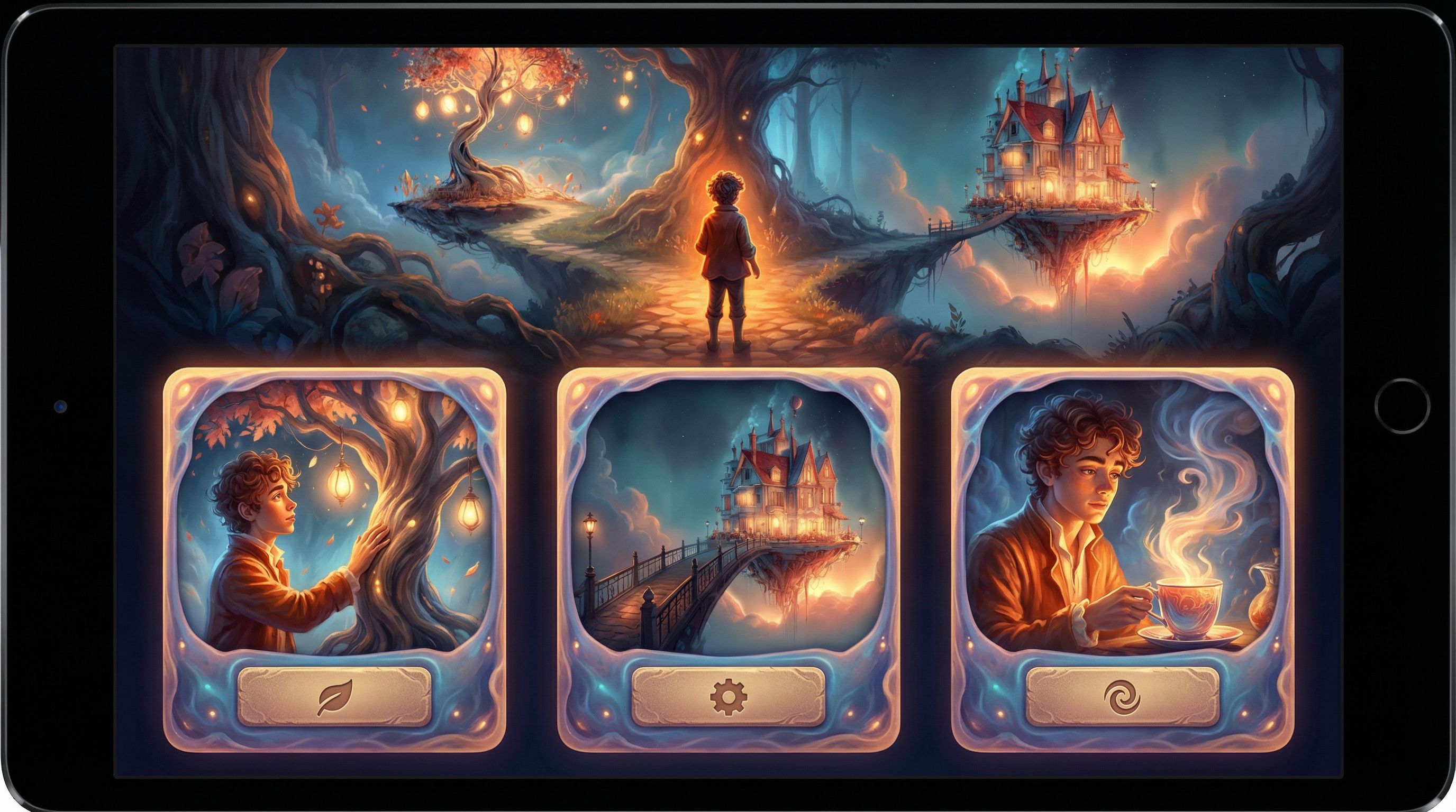
1. Card-style choices
- Each option appears in its own card with a subtle border or background.
- Cards stack vertically or appear in a grid under the main text.
- You can add a short label and a slightly longer description.
This pattern is especially powerful in tools like Questas, where you can pair each card with a distinct AI-generated image to hint at the tone of that path.
2. Button-style choices
- Short, verb-driven labels (e.g., “Trust the stranger”, “Ask for ID”, “Walk away”).
- High-contrast buttons that sit in a dedicated “decision zone” at the bottom of the screen.
- Ideal for mobile, where thumb reach matters.
3. Dialogue-wheel or radial choices
- A circular menu that appears over or under a character’s portrait.
- Each segment represents a different attitude or approach (e.g., calm, aggressive, curious).
- Works best for character-driven scenes, less so for navigation.
Design guidelines
- Use consistent styling. Every choice in your story should look like the same type of element.
- Separate choices from prose with space. White space is a UX superpower; give players a clear visual pause.
- Make them obviously tappable/clickable. Use hover states, pressed states, and clear affordances.
When you build in Questas, you can set a visual pattern for your choices once and reuse it across branches—so your story feels cohesive even as it fans out.
Principle #2: Anchor Choices in a Strong Sense of “Where Am I?”
Branching stories are spatial as much as they are narrative. Players build a mental map:
- Where they’ve been
- Where they might go
- What’s still unexplored
If that mental map collapses, frustration follows.
Helpful patterns for orientation
1. Soft map indicators
You don’t always need to show the full node graph. Instead, try:
- A chapter indicator (e.g., “Act II · Scene 3 of 8”).
- A path label (“Route: Harbor Escape”).
- A progress bar that fills as they move toward an ending.
This gives a sense of movement without spoiling the structure.
2. Breadcrumbs for key milestones
Show 2–4 major beats the player has already passed, like:
Onboarded → Met the Mentor → Chose the Risky Plan
This pattern works beautifully for training scenarios and onboarding stories. If you’re building learning content, you can pair it with the ideas from Branching for Busy Minds: Micro-Learning and Just‑in‑Time Training Scenarios Built in Questas to keep sessions short but coherent.
3. Optional map or timeline views
For more complex adventures, consider an optional “Story Map” screen:
- Nodes representing scenes.
- Lines representing branches already taken.
- Locked or hidden nodes for future discoveries.
In a platform like Questas, you already see this graph as the creator. Offering a simplified player-facing version can be great for replay-heavy stories or educational simulations where reflection is part of the goal.
UX tips
- Don’t overexpose the graph. Too much structure can make the story feel mechanical.
- Use labels, not just numbers. “Checkpoint: Evacuation Plan Chosen” is more meaningful than “Node 14.”
- Signal when you’re near an ending. A subtle “Approaching climax” or visual tension (color shifts, audio) helps players gear up emotionally.
Principle #3: Align Choice Density with Cognitive Load
Not every screen should have three or four options. Sometimes one strong decision is enough; sometimes you need a quick, low-stakes fork.
Think in “decision beats”
Borrow a rhythm from narrative design and learning science:
- High-focus beats: Major decisions with clear stakes. Fewer options (2–3), more context, more visual emphasis.
- Low-focus beats: Small flavor or information-gathering choices. More options are okay, but consequences should feel lighter.
If you’re designing training or educational content, this aligns with research on desirable difficulty—you want meaningful challenge, not constant overwhelm. Our post Beyond Gamification: What Learning Science Can Teach Us About Better Branching Stories dives deeper into how to pace difficulty and reflection.
Practical rules of thumb
- 2–3 options for pivotal choices. Anything more risks analysis paralysis.
- 4+ options only for low-stakes or menu-like screens. For example, choosing which room to explore next.
- Avoid “mystery meat” options. Each choice should communicate a clear intent, even if outcomes are surprising.
In Questas, you can visually group low-stakes choices (e.g., in a compact grid) and give high-stakes choices more breathing room and cinematic buildup.
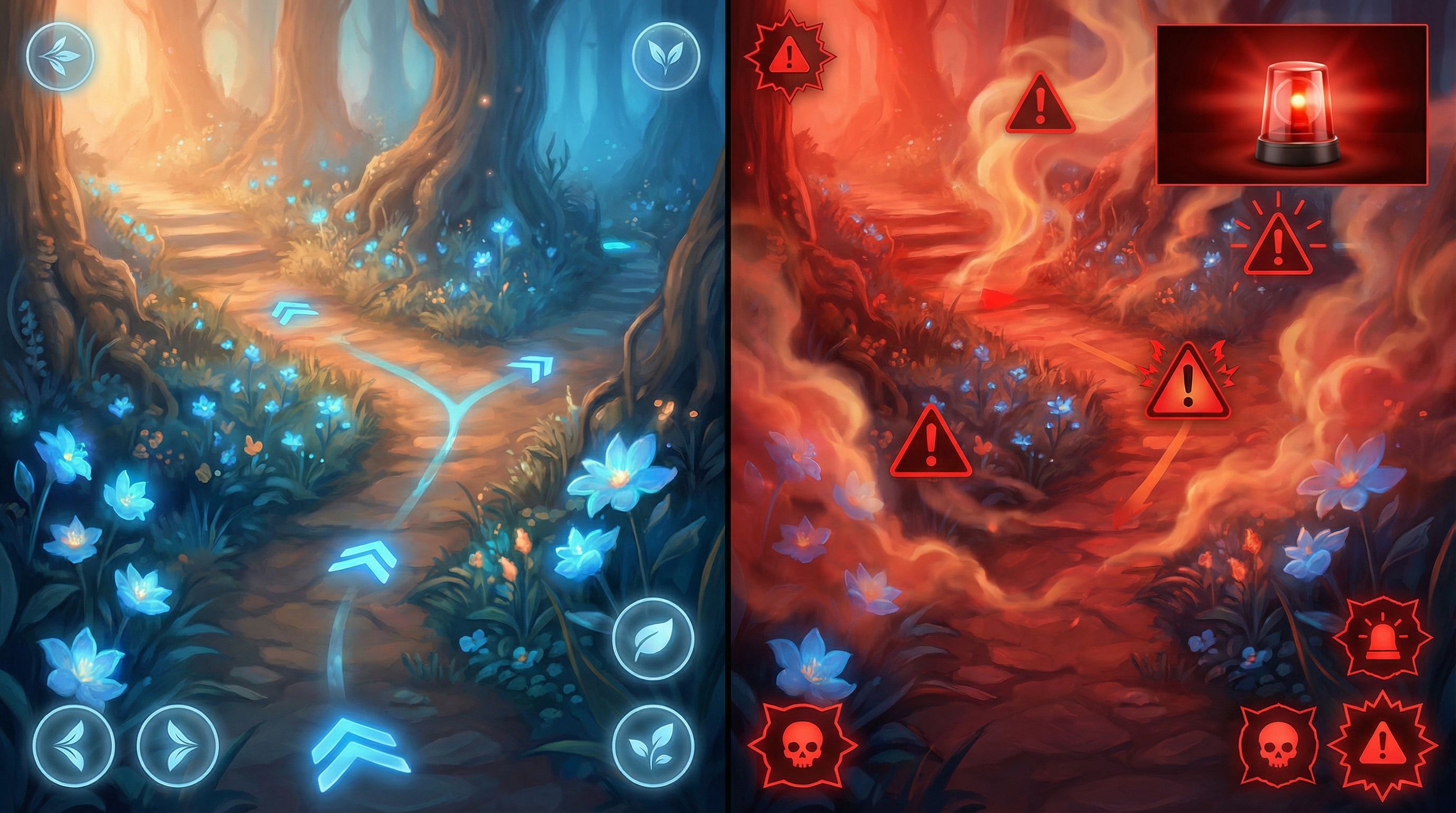
Principle #4: Use Visuals and Motion to Telegraph Stakes
Interface patterns are not just about boxes and buttons. Your images, micro‑videos, and motion cues can do a lot of UX work.
Visual cues that support decision-making
1. Consistent character imagery
When players recognize characters instantly, they can focus on what’s changing in the scene, not on who’s speaking. That’s why keeping your AI-generated characters on-model is a UX concern, not just an art concern. (If you struggle with this, you’ll find concrete fixes in AI Art Pitfalls and Fixes: Keeping Your Questas Visuals On-Model, On-Brand, and Not Weird.)
2. Micro‑video for emotional emphasis
Short loops—like a flickering warning light, a tightening grip on a steering wheel, or a storm rolling in—can:
- Signal that a choice is urgent.
- Highlight the object or area that matters.
- Make consequences feel more tangible.
Paired with thoughtful UX, micro‑video can guide attention without shouting. Our post on Storytelling with AI Video Loops: How to Use Micro‑Cutscenes to Signal Stakes and Consequences in Questas goes deep on this.
3. Color and typography for stakes
- Use warm, intense colors (or a specific accent) to mark high-risk decisions.
- Use neutral tones and lighter fonts for low-stakes or exploratory options.
- Keep accessibility in mind: rely on multiple cues (icons, wording), not color alone.
Principle #5: Make Feedback Immediate and Legible
A choice only feels meaningful if players can see what it changed.
Types of feedback to build in
1. Instant narrative feedback
Right after a choice, show:
- A line of inner monologue (“You feel your stomach knot as you sign the form.”)
- A visible reaction from another character.
- A small environmental shift (doors locking, weather changing).
2. System feedback
If your story tracks variables (trust, suspicion, resources), consider:
- A subtle icon pulse when a stat changes.
- A short tooltip: “Trust with Mira increased.”
- A log or journal that updates with consequences.
3. Delayed payoff with reminders
When a choice pays off later, remind players:
Because you shared the access code earlier, the terminal unlocks without an alarm.
This line of UX copy connects dots and reinforces that their earlier decision mattered.
In Questas, you can use conditional logic and variables to power this kind of feedback, then surface it with clear, concise text and visuals.
Principle #6: Design for Replays from the Start
Effortless UX doesn’t just apply to a single run. Many of the best branching stories are meant to be replayed.
Patterns that support replayability
1. Fast-forward and “seen” indicators
- Allow players to quickly skip passages they’ve already read.
- Mark previously seen choices or scenes with a subtle icon or color.
2. Smart checkpoints
- Let players restart from major decision hubs instead of from the very beginning.
- Show which endings they’ve unlocked and which are still hidden.
3. Compact summaries between runs
After each run, offer a short recap:
- Key decisions made
- Consequences triggered
- Endings reached
This helps players plan their next route and lowers friction to “one more run.” If you’re designing your story in Questas, you can structure these hubs visually in the editor so they’re easy to maintain as your narrative grows.
For a deeper dive into replay design, check out Replay Value by Design: How to Plan Secrets, Unlockables, and Hidden Paths in Questas.
Principle #7: Test UX Like a Game Designer, Not Just a Writer
No matter how thoughtful your patterns are on paper, real players will surprise you.
What to watch for in playtests
- Hesitation at choice moments. Are players pausing because they’re emotionally torn (good) or because they’re confused (bad)?
- Missed interactive elements. If multiple testers don’t realize something is clickable, your affordances aren’t strong enough.
- Backtracking or rage-quitting. Often a sign that orientation or feedback is failing.
Simple playtest scripts
Ask testers to think aloud while they play:
- “Tell me what you think each option will do before you click it.”
- “If you had to label this scene in one phrase, what would you call it?”
- “When did you feel most in control? Least in control?”
Then iterate:
- Adjust choice labels to better match player expectations.
- Add or remove options where players feel overloaded or railroaded.
- Tweak visual cues around stakes and orientation.
If you want a more structured approach, our guide Playtesting Your Questas Like a Game Designer: Scripts, Checklists, and What to Watch For offers ready-made templates.
Bringing It All Together in Questas
The good news: you don’t need a custom engine or a UX team to apply these patterns. A visual, no-code platform like Questas bakes many of them into how you build:
- Scene-based editor: Naturally encourages you to separate narrative beats and decision points.
- Branching graph view: Helps you plan orientation, checkpoints, and replay structure from the start.
- AI-generated images and micro‑video: Let you telegraph stakes and tone visually without a full art department.
- Variables and conditions: Power meaningful feedback and callbacks to earlier choices.
You bring the story and intention; the tool handles the plumbing.
Quick Recap
To make branching stories feel effortless to play, focus on how choices are seen, felt, and understood—not just where they lead.
Key takeaways:
- Separate choices from prose. Use distinct cards or buttons with consistent styling.
- Keep players oriented. Light-touch progress indicators, breadcrumbs, and (optionally) simple maps go a long way.
- Match choice density to stakes. Big moments deserve fewer, clearer options.
- Use visuals and motion wisely. Images, color, and micro‑video can guide attention and signal risk.
- Make consequences legible. Immediate and delayed feedback turns clicks into meaningful decisions.
- Design for replays. Checkpoints, “seen” markers, and recaps encourage exploration.
- Playtest the UX. Watch where players struggle, then refine labels, layouts, and cues.
Your Next Step: Turn One Scene into a UX Playground
You don’t need a full epic to start applying these patterns. Pick a single scene—a tough decision from a story, a tricky moment from a training, or a key fork in a customer journey—and treat it as your UX lab.
Here’s a simple way to begin:
- Draft the scene in plain text. One situation, two or three choices.
- Open Questas and recreate that scene using card- or button-style choices.
- Add one visual cue (an image, a looping video, or a color shift) that telegraphs stakes.
- Invite one friend or colleague to play it. Watch where they hesitate or misinterpret an option.
- Tweak labels, spacing, and feedback based on what you see.
That’s it. You’ve just taken your first deliberate step into UX‑driven interactive storytelling.
Adventure awaits—now make the path through it feel as effortless, and as irresistible, as the story you’re trying to tell.